13Chapter 13 - Categorical predictors and non-linear effects in Regression Models
In this chapter we cover three extensions of the multiple regression model, all of which use the same linear machinery of Chapter 12 but let it represent much richer relationships:
Regression with categorical predictors
Interaction effects in multiple regression
Quadratic effects in multiple regression
The unifying idea is worth stating up front. “Linear regression” means linear in the coefficients, not linear in the variables. As long as the model is a weighted sum of terms, we are free to make those terms anything we like — a dummy variable, a product of two variables, a squared variable. This one observation extends the reach of the linear model enormously.
13.1 Introduction
So far we have included only continuous independent variables in our regression models. A categorical variable is usually non-numeric and represents groups into which observations can be classified. Before including one in a regression, we must code it in a special way.
A categorical variable typically has no meaningful numeric ranking, but is useful for classification. For a sample of companies, industry is categorical: we cannot sum or average industries, only count how many firms fall into each.
Some numeric variables can also be treated as categorical. Year, for example, can enter a regression either as a number (capturing a linear trend) or as a set of categories (capturing a separate effect for each year, of any shape).
When we want to evaluate the effect of one variable on a dependent variable, it is good practice to include control variables. A control variable is not the focus of the study, but prior research or reasoning suggests it is related to the dependent variable. Categorical variables are often included as controls.
If we regress Y on an explanatory variable of interest plus one or two controls, and the explanatory variable remains significant, we can say the effect holds even after accounting for the controls. This makes the result substantially more credible. As we will see in this chapter’s example, adding the right control variable can change a coefficient dramatically — which is precisely why omitting it would have been a mistake.
13.2 Coding categorical variables
Imagine a dataset in which each observation has several numeric features of a company plus one categorical variable classifying firms into two groups: manufacturing and non-manufacturing. We cannot use the text label as an X variable. We must create a dummy variable — a variable taking only the values 0 and 1 — assigning 1 to manufacturing firms and 0 to the rest.
13.2.1 Dummy coding versus one-hot coding
With more than two categories, there are two ways to proceed, and the difference matters.
One-hot encoding creates one binary column per category. For a variable with three industries (Retail, Manufacturing, Services) it creates three columns:
Firm
Retail
Manufacturing
Services
A
1
0
0
B
0
1
0
C
0
0
1
Dummy encoding drops one column — the reference or base category:
Firm
Manufacturing
Services
A (Retail)
0
0
B
1
0
C
0
1
ImportantWhy one-hot encoding breaks a regression: the dummy variable trap
Look at the one-hot table again. In every row, the three columns sum to exactly 1:
But the regression model already contains an intercept, which is a column of 1s. So one of the dummy columns is an exact linear combination of the others and the intercept. This is perfect multicollinearity, and it violates assumption 7 from Chapter 9.
Why is that fatal? Because the OLS solution requires inverting the matrix (X'X), and perfect collinearity makes that matrix singular — it has no inverse. Geometrically, there is no longer a unique set of coefficients that minimizes the sum of squared errors: infinitely many combinations give exactly the same fit. The optimization problem has no single answer, so the software either returns an error or silently drops a column.
The fix is simply to drop one category. The dropped category becomes the reference, and every remaining coefficient is interpreted relative to it. No information is lost — with k categories, k-1 dummies fully determine which group an observation belongs to.
Note that one-hot encoding is perfectly fine for machine learning models that do not invert a matrix (decision trees, neural networks with regularization). It is specifically the combination of one-hot encoding and an intercept in a linear model that fails. This is why the two conventions coexist.
13.3 An example: study hours, teaching method and test grades
Our dataset d1 is a random sample of 60 students with three variables:
Y_grade — the grade obtained on a test
X1_hrs — the number of hours spent studying for the test
X2_method — whether the student followed a didactic method based on writing, or followed no particular method
Let’s download the data:
import pandas as pdimport numpy as npimport requestsimport matplotlib.pyplot as pltimport statsmodels.formula.api as smfheaders = {'User-Agent': 'Mozilla/5.0 (Windows NT 10.0; Win64; x64) ''AppleWebKit/537.36 (KHTML, like Gecko) ''Chrome/91.0.4472.124 Safari/537.36'}url1 ='https://www.apradie.com/datos/ch11_d1.csv'response1 = requests.get(url1, headers=headers)withopen('ch11_d1.csv', 'wb') as f: f.write(response1.content)df = pd.read_csv('ch11_d1.csv')print(df.head())print(df.tail())
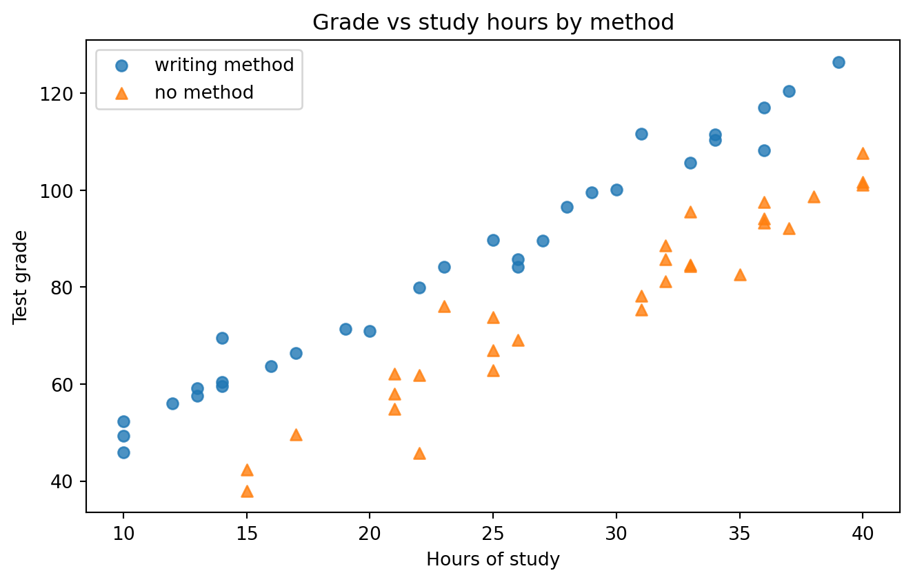
Before modeling anything, let’s look at the data — the lesson of Anscombe’s quartet in Chapter 8.
plt.figure(figsize=(7, 4.5))for label, marker in [("writing method", "o"), ("no method", "^")]: sub = df[df["X2_method"] == label] plt.scatter(sub["X1_hrs"], sub["Y_grade"], marker=marker, alpha=0.8, label=label)plt.xlabel("Hours of study")plt.ylabel("Test grade")plt.title("Grade vs study hours by method")plt.legend()plt.tight_layout()plt.show()
Figure 13.1: Test grade versus study hours, with students separated by teaching method.
The plot already reveals the structure: two roughly parallel bands of points. Both groups improve with study time at a similar rate, but one band sits consistently above the other. Keep that picture in mind — the models that follow are simply ways of describing it numerically.
Notice something surprising. Students who used the writing method obtained higher grades, and yet they studied fewer hours on average. This is exactly the situation in which omitting a variable will distort our conclusions.
13.3.1 Model 1: ignoring the categorical variable
First, the naive model that regresses grade on study hours alone:
Each additional hour of study is associated with about 2.09 additional grade points, and the model explains about 74% of the variance. That looks like a perfectly respectable result — and it is biased.
13.3.2 Model 2: adding the dummy variable
Now we code the categorical variable as a dummy, using “no method” as the reference category:
# 1 if the student used the writing method, 0 otherwise:df["method"] = (df["X2_method"] =="writing method").astype(int)m2 = smf.ols("Y_grade ~ X1_hrs + method", data=df).fit()print(m2.summary().tables[1])print(f"R-squared = {m2.rsquared:.4f}")
The change is dramatic. R^2 jumps from 0.74 to 0.96, and the coefficient on study hours rises from 2.09 to 2.48.
ImportantOmitted variable bias, seen directly
This is one of the clearest demonstrations of omitted variable bias you will encounter, so it is worth unpacking carefully.
In Model 1, the effect of the teaching method was not measured — so it went into the error term. But method is correlated with study hours (writing-method students studied fewer hours). That correlation violates the exogeneity assumption of Chapter 9, and the coefficient on X1_hrs absorbed part of the method effect with the wrong sign, dragging it down from 2.48 to 2.09.
The direction of the bias follows a simple rule:
\text{Bias} = \beta_{\text{omitted}} \times (\text{correlation between omitted variable and } X)
Here the method effect is strongly positive (+21) and its correlation with study hours is negative, so the product is negative — the estimate was biased downward. Model 1 understated the value of studying by about 16%.
The general lesson is the one that matters most in applied work: a coefficient is only interpretable relative to what else is in the model. Adding more data would not have fixed Model 1. Only adding the right variable does.
Now the interpretation of each coefficient in Model 2:
Intercept (b_0 \approx 4.70): the expected grade for a student who studies zero hours and uses no method (the reference category). Note this is an extrapolation outside the data range, so it should not be over-interpreted.
X1_hrs (b_1 \approx 2.48): each additional hour of study raises the expected grade by about 2.48 points, holding the method constant. This is now the effect of study hours purified of the method effect.
method (b_2 \approx 21.11): students using the writing method score about 21 points higher than students using no method, holding study hours constant. This is the key interpretive rule for a dummy coefficient: it is the difference in the intercept between the group and the reference group.
Both coefficients have t-statistics far above 2, so both effects are highly significant.
13.3.3 Writing the equation for each group
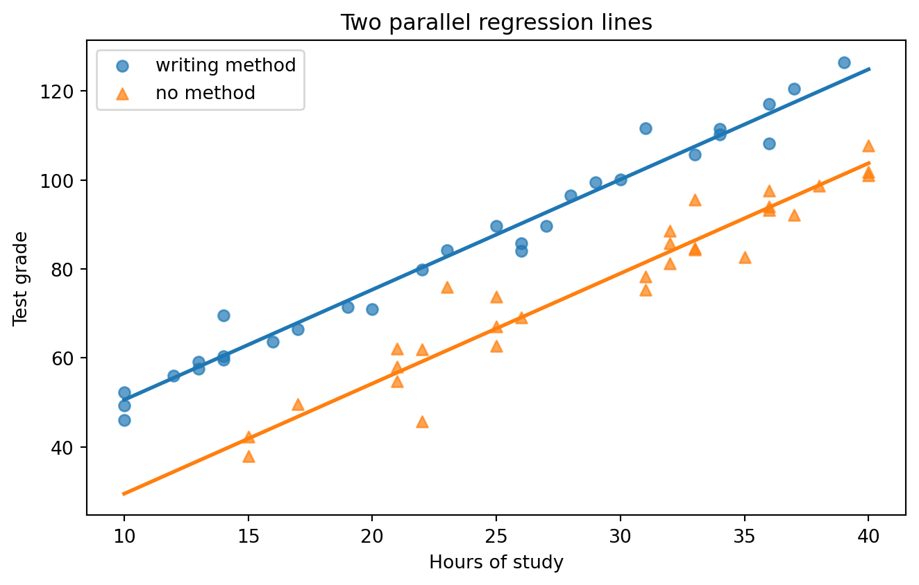
A regression with a dummy variable is really two parallel lines in one equation. Substituting the two possible values of the dummy:
The two lines have the same slope (2.48) and different intercepts (4.70 versus 25.81). This is the geometric meaning of a dummy variable: it shifts the line up or down without tilting it.
Figure 13.2: The dummy variable model fits two parallel lines: same slope, different intercepts.
13.3.4 More than two categories
With k categories we create k-1 dummies. Suppose the method variable had three levels — writing, flashcards, and no method — with “no method” as the reference:
This produces three parallel lines. b_2 is the gap between writing and no method; b_3 is the gap between flashcards and no method; and the gap between writing and flashcards is b_2 - b_3. In pandas, pd.get_dummies(df["X2_method"], drop_first=True) performs exactly this coding — note the drop_first=True, which is what avoids the dummy variable trap.
13.4 Interaction effects
The model above forces both groups onto parallel lines: it allows the method to change the level of the grade, but not the return to studying. What if we believe the writing method also makes each hour of study more productive? That is a question about whether the two lines have different slopes, and it is answered with an interaction term.
An interaction is simply the product of two variables:
# The * operator in a formula creates both main effects and the interaction:m3 = smf.ols("Y_grade ~ X1_hrs * method", data=df).fit()print(m3.summary().tables[1])print(f"R-squared = {m3.rsquared:.4f}")
So now both the intercept and the slope differ between groups:
b_2 is the difference in intercepts
b_3 is the difference in slopes — the extra grade points per study hour that the writing method delivers
NoteReading this particular result
The interaction coefficient b_3 is small and its p-value is well above 0.05, so we cannot reject the hypothesis that the two slopes are equal. Notice also that R^2 barely moved from Model 2.
The conclusion is that the writing method gives students a constant advantage of roughly 21 points, but does not change how much each additional hour of study is worth. Both groups gain about 2.4 points per hour.
This is a genuinely useful finding, and it matches the two parallel bands we saw in the very first scatter plot. It also illustrates good practice: prefer the simpler model when the added complexity is not statistically supported. Model 2 is the model to report here.
WarningTwo rules for interactions
Always include the main effects. If you include Hours \times Method, you must also include Hours and Method separately. Omitting a main effect forces the model through arbitrary constraints and makes the interaction uninterpretable.
The main effect changes meaning. Once an interaction is present, b_1 is no longer “the effect of hours” in general — it is the effect of hours when the other variable equals zero. This is why interaction models are often estimated with the continuous variables centred (each variable minus its mean), so that “zero” means “at the average” rather than an impossible value.
Interactions are how a linear model expresses the idea that “it depends”. Some business examples:
The effect of a price discount on sales depends on whether the product is advertised.
The effect of firm size on profitability depends on the industry.
The effect of debt on firm value depends on the volatility of cash flows — the inverted-U from Chapter 2.
13.5 Quadratic effects
Interactions let a slope depend on another variable. A quadratic term lets the slope depend on the variable itself — that is, it models a curve.
The trick is exactly as simple as it sounds: create a new variable equal to X squared and put it in the model.
Y = b_0 + b_1 X + b_2 X^2 + \varepsilon
This is still a linear regression, because it is linear in the coefficients b_0, b_1, b_2. We have not changed the estimation method at all; we have only added a column.
The slope of Y with respect to X is now the derivative:
\frac{\partial Y}{\partial X} = b_1 + 2 b_2 X
which depends on X. This gives the model its curvature:
If b_2 > 0, the curve is U-shaped (convex): the effect of X gets stronger as X grows.
If b_2 < 0, the curve is inverted-U (concave): the effect of X weakens and eventually turns negative.
Setting the derivative to zero gives the turning point, the value of X at which the effect changes direction:
X^{*} = -\frac{b_1}{2 b_2}
This turning point is often the most interesting number in the whole model — it is the optimal leverage ratio, the profit-maximizing price, the stress level beyond which performance declines.
Let’s test whether the effect of study hours is curved in our data. There is a plausible theory that it should be: at some point, additional hours produce diminishing returns from fatigue.
The quadratic term is not statistically significant, so we have no evidence of diminishing returns within the observed range of 10 to 40 hours. The linear specification of Model 2 stands.
This is worth emphasizing as a methodological point: testing for a non-linear effect and not finding one is a real result. It licenses the simpler model. The mistake would have been to assume linearity without ever checking.
WarningCautions when using quadratic terms
Multicollinearity.X and X^2 are strongly correlated, which inflates standard errors. CentringX before squaring it (using (X - \bar{X}) and (X - \bar{X})^2) largely fixes this without changing the fit.
Never interpret b_1 and b_2 separately. Neither one is “the effect of X”. Only the combined derivative b_1 + 2b_2 X is meaningful. Reporting “the coefficient on hours is 1.30” from a quadratic model is meaningless without the quadratic term alongside it.
Check that the turning point falls inside your data. A model can report a turning point at 200 study hours when the data only ranges to 40. That turning point is an artifact of extrapolation, not a finding.
Quadratics extrapolate terribly. A parabola eventually shoots off to infinity in both directions. Never use a quadratic model to predict outside the range of the observed data.
13.6 Summary
All three techniques in this chapter extend the reach of the linear model without changing its machinery:
Technique
New term
What it lets the model do
Interpretation
Dummy variable
D (0/1)
Shift the line up or down by group
b = difference in intercepts
Interaction
X \times D or X_1 \times X_2
Let the slope differ by group
b = difference in slopes
Quadratic
X^2
Let the slope change with X
Turning point at -b_1 / 2b_2
The recurring theme is the one from the start of the chapter: linear regression requires linearity in the coefficients, not in the variables. Once you internalize that, an enormous class of relationships — group differences, conditional effects, diminishing returns, optimal points — becomes accessible with the tools you already have.
And the recurring caution is equally important: every one of these terms adds parameters, and every added parameter raises R^2 whether or not it captures anything real. Add them because theory suggests them, keep them because the data supports them, and always plot the result to check that it means what you think it means.