Descriptive statistics is the highlight reel of your data. Instead of staring at endless rows of numbers, we boil them down into a few meaningful summaries that tell us the “story so far”.
It is our first step in understanding a phenomenon: finding out what is typical and how much things change.
💡 Imagine this:
In Economics, you want to know how a country’s economy has performed over the last decade. You could calculate the average annual GDP growth to see the overall trend.
In Finance, you might look at the average yearly return of an investment over the last 5 years — and check how bumpy the ride was by measuring the variability of those returns.
Descriptive statistics is a set of summaries of the raw data of one or several variables that represent a phenomenon. These summaries — averages, variability, and the shape of the data — give us a first general idea of what is going on before we attempt any modeling.
So descriptive statistics is basically asking two big questions about your data:
What is the “typical” value of a variable? → Measures of central tendency
How much does it vary around that typical value? → Measures of dispersion
A third question, which we will address in this chapter through the boxplot and in Chapter 5 through the histogram, is:
What is the shape of the data — is it symmetric or skewed?
The answer to this third question determines which measures of central tendency and dispersion we should trust. This is the single most important practical lesson of the chapter.
3.1 Central tendency measures
The main central tendency measures are:
Arithmetic mean
Median
Mode
3.1.1 Arithmetic mean
The arithmetic mean of a variable X is a simple measure that tells us the average value of all valid values of X, assuming that each value has the same importance (or weight). The variable X can represent any attribute of a subject. A subject can be an individual, a group, a team, a business unit, a company, a financial portfolio, an industry, a region, a country, etc.
An example of a variable X can be the monthly sales amount of a company for the last 3 years. In this case, the variable X will have 36 observations (36 monthly sales). The subject here is a company and the variable — the attribute — is the company’s sales over time. Another example is a variable that represents the daily returns of a financial portfolio over the last 2 years. In this case the variable will have about 500 observations, considering roughly 250 business days each year. The subject in this example is a financial portfolio, which might be composed of more than one stock and/or bond.
To calculate the arithmetic mean of a variable X we simply sum all of its non-missing values and then divide by the number of non-missing values:
Where N is the number of non-missing values (observations) of X. A missing value happens when the variable X has no value for a specific observation. It is important to note that a missing value is not a zero value: a missing sales figure means “we do not know the sales”, while a zero means “the company sold nothing”. Confusing the two is one of the most common — and most costly — mistakes in applied data analysis. When we work with real-world datasets it is very common to find missing values in many variables.
One disadvantage of the arithmetic mean is that it is very sensitive to extreme values. If a variable has a few extreme values, the arithmetic mean might not be a good representation of a typical or middle value. In the presence of a few very extreme values, the best measure of central tendency is the median, not the arithmetic mean.
NoteA quick intuition for why the mean is fragile
Think of the mean as the balance point of a seesaw where every observation has the same weight. A single observation placed very far from the rest acts like a person sitting at the very end of the seesaw: it can tilt the balance point far away from where most of the weight actually is. The median, by contrast, only cares about the order of the observations, not about how far away they are — so moving the most extreme value from 1 million to 100 million does not change the median at all.
3.1.2 The Median
Another measure of central tendency is the median. The median of a variable is its 50th percentile: the midpoint of its values when the values are sorted in ascending order. When we have an odd number of observations there is exactly one value in the middle, and that value is the median. When we have an even number of observations there are two middle values, so the median is the arithmetic mean of those two.
For example, suppose we want to know the typical size of the companies that trade shares in the Mexican stock market. These firms are called public firms. Firm size can be measured with different variables: we can use the total value of its assets (total assets), the market value, or the number of employees. In this example we will use total assets at the end of 2018 for all public Mexican firms. At the end of 2018 there were 146 Mexican public firms listed in the market exchange (“Bolsa Mexicana de Valores”, BMV).
The 2018 total assets of these 146 Mexican public firms are shown below (sorted alphabetically):
Mexican public firms in the BMV, 2018
Firm
Row #
Industry
2018 Total Assets (thousand pesos)
ACCEL
1
Services
$6,454,560
AEROMEXICO
2
Transport Services
$76,772,848
…
…
…
…
VOLARIS
145
Transport Services
$22,310,652
WALMART
146
Retail
$306,528,832
Now we sort the list from the lowest to the highest value of 2018 total assets:
The same firms, sorted by size
Firm
Size Rank
Industry
2018 Total Assets (thousand pesos)
INGEAL
1
Food & Beverages
$171,104
HIMEXSA
2
Textile
$494,378
…
…
…
…
FHIPO14
73
Real Estate
$27,979,184
TVAZTECA
74
Telecommunications
$27,988,054
…
…
…
…
AMERICA MOVIL
145
Telecommunications
$1,429,223,392
GFBANORTE
146
Financial Services
$1,620,470,400
The median is the midpoint of the sorted list. Since we have 146 firms — an even number — there is no single firm in the middle, so we average the two firms in positions 73 and 74. The median is therefore
The arithmetic mean of total assets for the same 146 firms is $97,860,896 thousand pesos, about $98 billion pesos — more than three times the median.
So which measure better represents the typical size of a Mexican public firm? In this case the median. We can say that the typical Mexican public firm holds about $28 billion pesos in assets, while the mean of $98 billion describes almost no firm in the sample.
TipCareful with “billion”
In this book we use the short scale: 1 billion = 1,000 million = 10^9. In Spanish, “billón” means 10^{12}, so $28 billion pesos here is “28 mil millones de pesos”, not “28 billones”. Being explicit about units is part of good statistical communication.
Then, what is the difference between the mean and the median? When the distribution of the values of a variable is close to a normal distribution, the mean and the median will be very similar, so either one can represent the typical value. When the variable has a few very extreme values, the distribution will not look normal: it will have a long tail on one side. In that case the best measure of central tendency is the median.
What is a normal distribution? It is a very common probability distribution of random variables, shaped like a symmetric bell. We will explain probability distributions in detail in Chapter 5. For now, just keep in mind that many variables across all disciplines follow a close-to-normal distribution — and many important business variables do not.
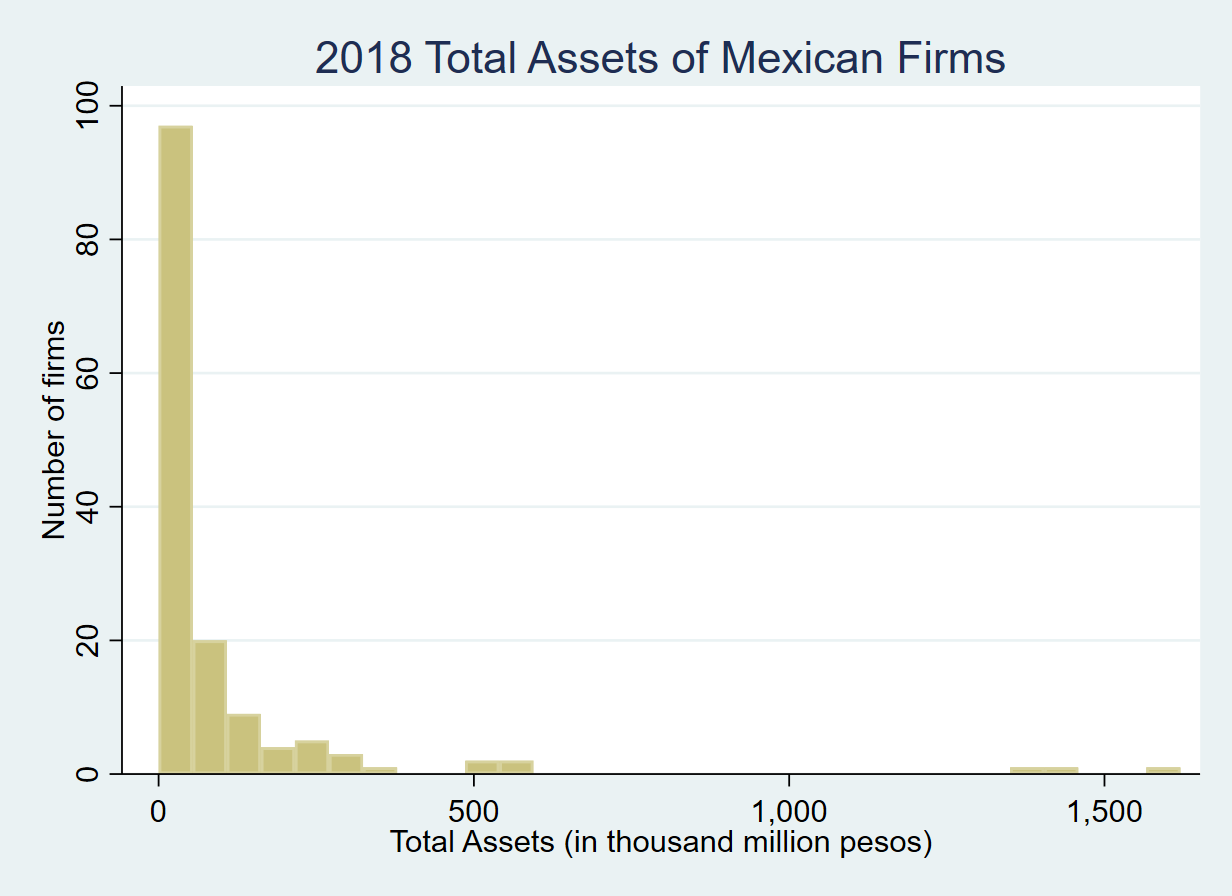
The median gives a better representation of the “typical” value of a variable than the arithmetic mean whenever the distribution of the values does not follow a normal distribution. In the case of 2018 total assets we can explore its distribution using a histogram:
Histogram of 2018 total assets of Mexican public firms
I will explain in more detail what a histogram is in Chapter 5. For now, read it like this: a histogram shows how often different ranges of values of a variable appear. Each bar covers a range of total assets, and its height is the number of firms that fall in that range.
This histogram does not look like a normally distributed variable. It is said to be skewed to the right (or positively skewed) because there is a long tail of a few firms with very high values of total assets. A normally distributed variable looks like a symmetric bell where most values cluster around the mean. Here, instead, we see that most firms — about 100 out of 146 — have total assets between 0 and $25 billion pesos. Only about 46 firms have assets above $25 billion. A handful of firms exceed $1,000 billion ($1 trillion) pesos: looking back at the sorted table, AMERICA MOVIL and GFBANORTE both hold more than $1,400 billion pesos in assets.
With the histogram we can see that about 68% of the firms (100 out of 146) hold less than $25 billion pesos in assets. The arithmetic mean is more than $98 billion, while the median is about $28 billion. The arithmetic mean is very sensitive to extreme values; the median is not. If we used the mean as the “typical” size of a Mexican firm, we would be describing a company far larger than roughly 85% of the sample.
In sum, for skewed distributions the median will be the better measure of central tendency, while the arithmetic mean will be biased toward the long tail. And since for normally distributed variables the median is very close to the mean, the median is a safe default: it works well in both cases.
Examples of business variables with a right-skewed distribution similar to total assets are employee salaries, family income in a region or country, firm sales, firm profits, city populations, and the number of users per app.
3.1.3 Mode
The mode is the value that appears most frequently in a variable. It is most useful for discrete or categorical variables — the most common credit rating, the most frequent number of items per order, the best-selling product size. For continuous variables the mode is not well defined, since it is very unlikely that two observations have exactly the same value; in that case we can speak of the modal interval, the tallest bar of the histogram.
The mode is rarely used as a central tendency measure for numeric variables, but it is the only one available for categorical variables: we cannot compute the mean industry of a firm, but we can say which industry is the most common.
3.2 Dispersion measures
Two variables can have the same mean and still be radically different. Consider two funds that both averaged a 10% annual return over the last 10 years: the first returned between 8% and 12% every year, while the second alternated between +60% and −40%. The average is the same; the experience of investing in them is not. Dispersion measures capture exactly this difference.
3.2.1 Variance and standard deviation
The standard deviation measures how much, on average, the individual values of a variable deviate from the mean.
The variance of a variable X is the average of the squared deviations of each individual value X_i from its mean:
\overline{X}=\frac{1}{N}\sum_{i=1}^{N}X_{i} = arithmetic mean of X
Why is the variance the average of squared deviations? Because if we did not square them, the positive and negative deviations would cancel out — in fact, the sum of the deviations from the mean is always exactly zero. Squaring is a trick that removes the signs so that deviations in both directions add up instead of canceling.
The variance is expressed in squared units, which our brains cannot easily interpret: if X is measured in pesos, the variance is in “squared pesos”. To get back to a measure expressed in the original units, we take the square root of the variance. This measure is called the standard deviation:
This identity — “the mean of the squares minus the square of the mean” — is worth memorizing. It is the fastest way to compute a variance by hand, and it reappears in Chapter 8 when we derive the covariance.
Most statistics textbooks and statistical software use (N-1) instead of N in the denominator. The resulting measure is called the samplevariance; dividing by N gives the populationvariance. Both formulas give very similar results when N is large, but the sample variance is slightly bigger, so it is a more conservative value.
Why (N-1)? Because we do not know the true population mean and must estimate it from the same data with \bar{X}. The observations are, by construction, closer to their own sample mean than to the true mean, so the sum of squared deviations is systematically too small. Dividing by (N-1) instead of N corrects exactly this bias. In technical terms, the sample variance is an unbiased estimator of the true variance. (Intuitively: once you know \bar{X} and N-1 of the observations, the last one is determined — so only N-1 deviations are free to vary. This is what we call degrees of freedom.)
Then, we can re-write the formula for the sample variance of X as:
By convention, Greek letters denote population parameters and Latin letters denote sample statistics: \sigma_X^2 and \sigma_X are the population variance and standard deviation, while S_X^2 and S_X are their sample counterparts. In practice we almost always work with samples, so almost every number reported by software is a sample statistic.
A useful companion to the standard deviation is the coefficient of variation, which expresses the standard deviation as a fraction of the mean:
CV(X) = \frac{S_X}{\bar{X}}
The CV is unit-free, so it lets us compare the variability of variables measured on completely different scales — for example, the volatility of a stock priced at $20 against one priced at $2,000.
3.2.2 Dispersion measures for skewed data: percentiles, IQR and the boxplot
The standard deviation has exactly the same weakness as the mean, and for exactly the same reason: it is built from the mean and it squares the deviations. Squaring means that an observation that is 10 times farther from the mean than the others contributes 100 times more to the variance. So in a skewed variable — salaries, firm assets, GDP per capita, insurance claims — a handful of extreme observations can dominate the standard deviation completely.
When the data are skewed we need dispersion measures built on the same logic as the median: measures that depend on the rank order of the observations rather than on their distance from the mean. These are called robust measures.
3.2.2.1 Percentiles
The percentilep of a variable is the value below which p percent of the observations fall, once the data are sorted in ascending order.
If the 90th percentile of employee salaries is $85,000, it means that 90% of employees earn less than $85,000 and 10% earn more. The median is simply the 50th percentile.
Percentiles are extremely intuitive for non-technical audiences, which makes them excellent for business reporting. Some examples:
In operations, service-level agreements are almost always written in percentiles: “95% of support tickets are resolved in under 4 hours” is a statement about the 95th percentile of resolution time. An average resolution time would hide the customers who waited two days.
In risk management, the Value at Risk (VaR) of a portfolio is a percentile of the return distribution. A 1-day 5% VaR of −3% means that on the worst 5% of days the portfolio loses more than 3%.
In human resources, salary bands are defined by percentiles of the market survey (“we pay at the 75th percentile of the market”).
3.2.2.2 Quartiles and the interquartile range (IQR)
Quartiles are the three percentiles that split the sorted data into four groups of equal size:
Q_1 = 25th percentile (the first quartile): 25% of observations are below it
Q_2 = 50th percentile = the median
Q_3 = 75th percentile (the third quartile): 75% of observations are below it
The interquartile range (IQR) is the distance between the third and first quartiles:
IQR = Q_3 - Q_1
The IQR is the width of the interval that contains the middle 50% of the data. This is the robust counterpart of the standard deviation: it tells us how spread out the bulk of the observations is, while completely ignoring the most extreme 25% on each side. Whatever happens in the tails — one billionaire, one catastrophic loss, one data-entry error with three extra zeros — the IQR does not move.
Two related robust measures are worth knowing:
The quartile coefficient of dispersion, \frac{Q_3-Q_1}{Q_3+Q_1}, is the robust analogue of the coefficient of variation: unit-free, and therefore comparable across variables measured on different scales.
The median absolute deviation (MAD) is the median of the absolute deviations from the median: MAD = \text{median}(|X_i - \text{median}(X)|). Software usually reports a normalized MAD, multiplied by 1.4826, so that for a normally distributed variable it estimates the same quantity as the standard deviation. This makes it directly comparable to S_X: if the normalized MAD is far below the standard deviation, the variable has heavy tails.
3.2.2.3 The boxplot
The boxplot (or box-and-whisker plot, introduced by John Tukey in 1970) is the graphical display of exactly these quantities. It is the fastest way to see the center, the spread and the skewness of a variable in a single picture. It is read as follows:
The box goes from Q_1 to Q_3, so its length is the IQR and it contains the middle 50% of the data.
The line inside the box is the median. Its position within the box tells us about skewness: if it sits near the bottom of the box, the data are skewed to the right.
The whiskers extend from the box out to the most extreme observation that is still within 1.5 × IQR of the box. That is, the whiskers stop at the last observation inside the interval [Q_1 - 1.5 \times IQR,\; Q_3 + 1.5 \times IQR]. The endpoints of that interval are called the fences.
Observations beyond the fences are plotted individually as potential outliers.
ImportantWhy 1.5?
The 1.5 multiplier is a convention, not a law of nature. It was chosen because for a normally distributed variable, only about 0.7% of observations fall outside the fences. So under normality, points beyond the whiskers are genuinely rare and worth inspecting. For a strongly skewed variable, however, many perfectly legitimate observations will fall beyond the upper fence. A point flagged by the boxplot is a candidate for investigation, not automatically an error and not automatically something to delete. In Chapter 4 we discuss what to do with these observations.
Boxplots are especially powerful for comparing groups: placing the boxplots of firm profitability by industry side by side reveals differences in both the typical level and the variability across industries in one glance, which a table of means cannot do.
3.2.2.4 A simple example: salaries in a small consulting firm
Let’s make all of this concrete with a small, hand-checkable example. A consulting firm has 11 employees. Their annual salaries, in thousands of pesos, sorted in ascending order, are:
Ten employees earn between 240 and 480 thousand pesos. The eleventh is the founder, who earns 4 million pesos a year.
Let’s compute the summary measures by hand first, so we know what the software should give us:
Median: with N=11 (odd), the median is the 6th value of the sorted list → \mathbf{340}.
Q_1: the value at position 0.25 \times (11-1) + 1 = 3.5, halfway between the 3rd value (280) and the 4th (300) → \mathbf{290}.
Q_3: the value at position 0.75 \times (11-1) + 1 = 8.5, halfway between the 8th value (380) and the 9th (420) → \mathbf{400}.
IQR = 400 - 290 = \mathbf{110}. The middle half of this firm’s employees earn within a band 110 thousand pesos wide.
Fences: Q_1 - 1.5 \times IQR = 290 - 165 = 125 and Q_3 + 1.5 \times IQR = 400 + 165 = 565. The founder’s salary of 4,000 is far beyond the upper fence, so the boxplot will flag it.
Mean = 7{,}380 / 11 = \mathbf{670.9} — a salary that no one in the firm actually earns, and which is higher than what 10 of the 11 employees make.
Now let’s verify this in Python, and — this is the key part — compare what happens to each measure when we remove the founder:
import numpy as npimport pandas as pdimport matplotlib.pyplot as plt# Annual salaries in thousands of pesossalaries = pd.Series([240, 260, 280, 300, 320, 340, 360, 380, 420, 480, 4000], name="salary")# The same firm without the founder:staff = salaries[salaries <1000]def summarize(x): q1, q3 = x.quantile(0.25), x.quantile(0.75)return pd.Series({"n": len(x),"mean": x.mean(),"median": x.median(),"SD": x.std(ddof=1),"Q1": q1,"Q3": q3,"IQR": q3 - q1 })comparison = pd.DataFrame({"All 11 employees": summarize(salaries),"Without the founder": summarize(staff)})comparison["% change"] = (100* (comparison.iloc[:, 0] / comparison.iloc[:, 1] -1)).round(1)comparison.round(2)
All 11 employees
Without the founder
% change
n
11.00
10.00
10.0
mean
670.91
338.00
98.5
median
340.00
330.00
3.0
SD
1106.39
74.51
1385.0
Q1
290.00
285.00
1.8
Q3
400.00
375.00
6.7
IQR
110.00
90.00
22.2
Look carefully at the last column. Adding one single observation to a group of ten:
Measure
Without founder
With founder
Change
Mean
338.0
670.9
+98%
Standard deviation
74.5
1,106.4
+1,385%
Median
330.0
340.0
+3%
IQR
90.0
110.0
+22%
The mean doubles and the standard deviation becomes fifteen times larger, while the median moves by 3% and the IQR by 22%. This is what “robust” means in practice.
If a journalist reported that “the average salary at this firm is 671 thousand pesos, with a standard deviation of 1,106”, every number would be arithmetically correct and the description would still be useless — and arguably misleading. The honest summary is: “the typical employee earns 340 thousand pesos; the middle half of the staff earns between 290 and 400 thousand; the founder earns 4 million.” That is a median, an IQR, and an explicitly reported outlier.
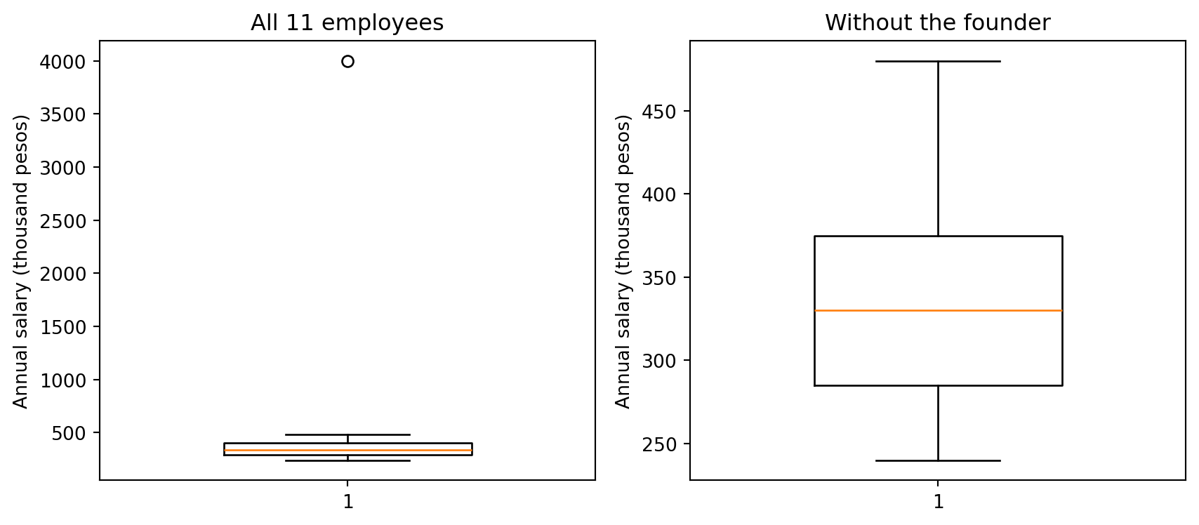
Figure 3.1: Boxplot of the 11 salaries. The box spans Q1 to Q3 (the IQR), the line inside is the median, the whiskers reach the most extreme values within 1.5 x IQR, and the founder’s salary appears as an isolated point beyond the upper fence.
Notice how the left panel is almost unreadable: the founder’s salary stretches the vertical axis so much that the box — which contains half the employees — is squashed into a thin line near the bottom. That visual compression is the message. It is the same distortion the mean and the standard deviation suffer from, made visible.
TipA practical rule of thumb
Before summarizing any variable, plot it. Then:
If the distribution is…
Report as center
Report as dispersion
Symmetric, no extreme values
Mean
Standard deviation
Skewed, or with extreme values
Median
IQR (and percentiles)
Unknown / not yet inspected
Both
Both
Reporting both costs one extra line of code. If they agree, you have learned that the variable is well behaved. If they disagree, you have learned something even more important.
3.3 Illustrating measures of descriptive statistics
Let’s now apply everything to a real and interesting dataset: Gross Domestic Product (GDP) per capita for all countries. GDP is the total monetary value of all final goods and services produced in a country, usually measured by quarter or by year. GDP per capita is GDP divided by the population — roughly, the average output produced per inhabitant.
The World Bank maintains a historical dataset of GDP and GDP per capita, freely accessible through its public API. Let’s download GDP per capita for all countries for 2024:
import requestsimport pandas as pdimport numpy as npfrom scipy import statsimport matplotlib.pyplot as pltIND ="NY.GDP.PCAP.CD"# World Bank code: GDP per capita (current US$)YEAR =2024url = (f"https://api.worldbank.org/v2/country/all/indicator/{IND}"f"?format=json&date={YEAR}:{YEAR}&per_page=20000")j = requests.get(url, timeout=30).json()# The API returns metadata in j[0] and the actual observations in j[1]:rows = [r for r in j[1] if r["value"] isnotNone]gdp = pd.DataFrame([{"country": r["country"]["value"],"iso3": r["countryiso3code"],"gdp_pc": float(r["value"])} for r in rows])# The API mixes individual countries with regional aggregates (e.g. "World",# "Euro area", "High income"). Aggregates have a blank or 3-letter code that is# not a real country, so we drop them using the World Bank country list:meta = requests.get("https://api.worldbank.org/v2/country?format=json&per_page=400", timeout=30).json()[1]real_countries = {c["id"] for c in meta if c["region"]["value"] !="Aggregates"}gdp = gdp[gdp["iso3"].isin(real_countries)].reset_index(drop=True)print(f"{len(gdp)} countries with GDP per capita data for {YEAR}")gdp.head()
200 countries with GDP per capita data for 2024
country
iso3
gdp_pc
0
Afghanistan
AFG
416.871146
1
Albania
ALB
11374.008578
2
Algeria
DZA
5752.990767
3
Andorra
AND
49357.437070
4
Angola
AGO
2720.819007
Note
Filtering by the World Bank’s own region = "Aggregates" flag is much safer than filtering by keywords in the country name. A keyword list will silently drop real countries — “Central African Republic” contains “Central”, “South Africa” contains “Africa” — and will miss aggregates whose names you did not anticipate. Whenever a data source gives you a metadata field, use it instead of pattern-matching on text.
Now we compute the full set of summary measures, both classical and robust:
def quick_stats(x): x = pd.Series(x).dropna() q1, q3 = x.quantile(0.25), x.quantile(0.75)return pd.Series({"n": len(x),"mean": x.mean(),"median": x.median(),"trimmed mean 20%": stats.trim_mean(x.to_numpy(), 0.2),"SD": x.std(ddof=1),"IQR": q3 - q1,"MAD (normalized)": stats.median_abs_deviation(x, scale="normal"),"skewness": x.skew(),"min": x.min(),"Q1": q1,"Q3": q3,"max": x.max(), })x = gdp["gdp_pc"]x_trimmed = x[x <= x.quantile(0.99)] # dropping the richest 1% of countriespd.DataFrame({"GDP per capita": quick_stats(x),"GDP per capita (drop top 1%)": quick_stats(x_trimmed)}).round(1)
GDP per capita
GDP per capita (drop top 1%)
n
200.0
198.0
mean
22364.4
20023.7
median
7852.4
7717.5
trimmed mean 20%
12049.1
11772.5
SD
35312.9
26407.5
IQR
26579.3
25876.3
MAD (normalized)
9805.6
9554.3
skewness
3.8
2.2
min
216.2
216.2
Q1
2817.9
2757.9
Q3
29397.2
28634.2
max
288001.6
142250.4
Three things are worth reading off this table:
The mean is well above the median. This is the signature of a right-skewed variable: a few very rich countries pull the average up, so the “average country” implied by the mean is richer than most countries actually are. The positive skewness coefficient confirms it numerically.
The standard deviation is much larger than the IQR and the normalized MAD. Under normality these three would be broadly comparable. When SD is several times the MAD, the tails are heavy and the SD is being driven by a small number of observations.
Dropping just the top 1% barely moves the median, the IQR and the MAD, but noticeably shifts the mean and the SD. Same lesson as the salary example, now on 200-odd countries instead of 11 — this is not an artifact of a tiny sample.
The trimmed mean in the table is a useful middle ground: it discards the top and bottom 20% of observations and averages the rest. It keeps some of the mean’s use of magnitudes while gaining much of the median’s robustness.
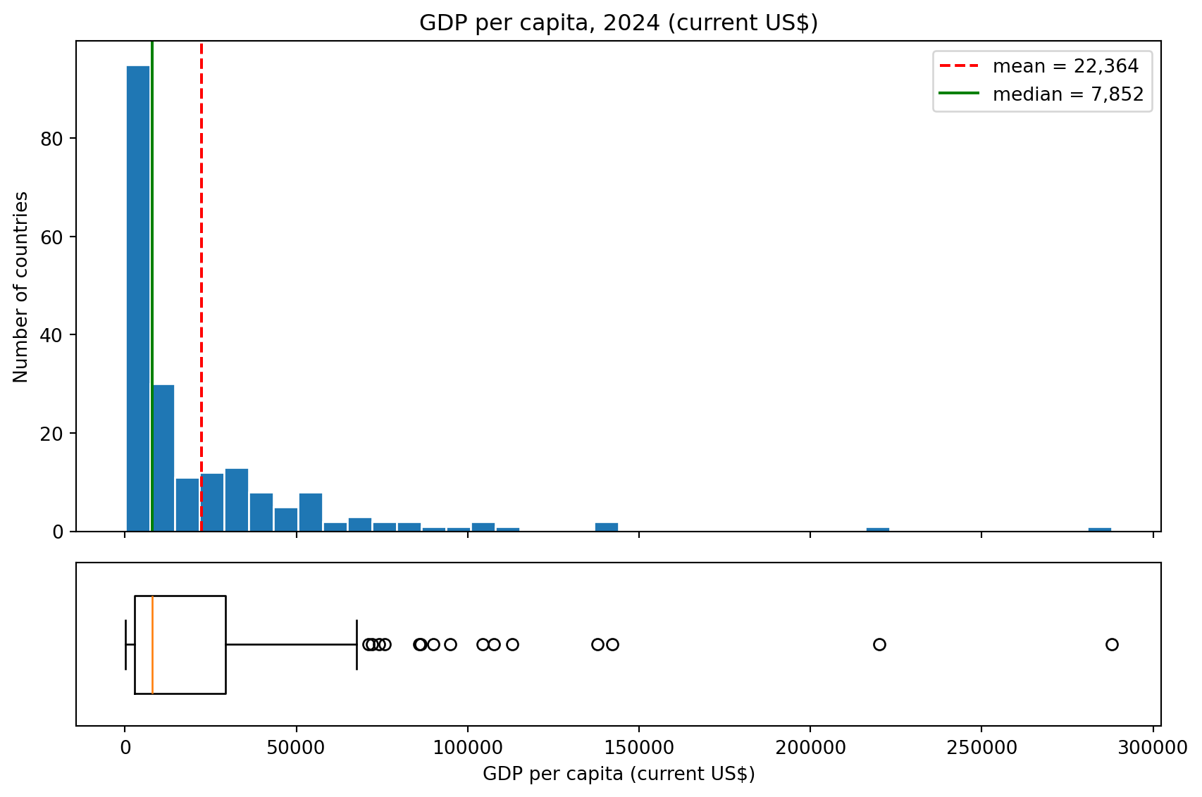
Figure 3.2: GDP per capita across countries in 2024: a histogram and a boxplot of the same data. Both show a strong right skew.
The histogram and the boxplot tell the same story in two languages. In the histogram, the green median line sits clearly to the left of the red mean line — the classic fingerprint of right skewness. In the boxplot, the median line sits near the left edge of the box, the right whisker is much longer than the left one, and a string of high-income countries appears as individual points beyond the upper fence.
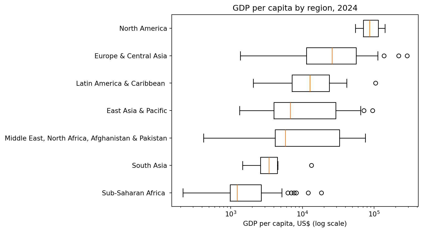
And a boxplot really shines when comparing groups. Let’s see how GDP per capita varies by region:
region_of = {c["id"]: c["region"]["value"] for c in metaif c["region"]["value"] !="Aggregates"}gdp["region"] = gdp["iso3"].map(region_of)order = (gdp.groupby("region")["gdp_pc"].median().sort_values().index)data = [gdp.loc[gdp["region"] == r, "gdp_pc"].values for r in order]plt.figure(figsize=(9, 5))plt.boxplot(data, vert=False, widths=0.6)plt.yticks(range(1, len(order) +1), order)plt.xscale("log") # log scale, since the variable spans 3 orders of magnitudeplt.xlabel("GDP per capita, US$ (log scale)")plt.title(f"GDP per capita by region, {YEAR}")plt.tight_layout()plt.show()
Figure 3.3: GDP per capita by World Bank region, 2024. Comparing distributions rather than only averages reveals differences in spread as well as in level.
Notice two modeling choices here that are worth internalizing:
We sorted the regions by their median, not their mean, so that the ordering is not driven by a single wealthy country in a region.
We used a logarithmic scale on the horizontal axis. GDP per capita spans three orders of magnitude, from a few hundred dollars to more than one hundred thousand. On a linear scale all the poorer regions would be crushed against the left edge. Taking logs is the standard remedy for right-skewed variables, and Chapter 4 explains why it works and when to use it.
3.4 Summary
Question
Symmetric data
Skewed data
What is typical?
Mean \bar{X}
Median (Q_2)
How spread out is it?
Standard deviation S_X
IQR = Q_3 - Q_1, or normalized MAD
How do I compare scales?
Coefficient of variation S_X/\bar{X}
Quartile coefficient of dispersion
How do I see the shape?
Histogram
Histogram and boxplot
The overarching idea of this chapter is that descriptive statistics is not a mechanical step to complete before “the real analysis” begins. Choosing the wrong summary can reverse the conclusion of a study. The mean and the standard deviation are excellent tools when the data are roughly symmetric, and misleading ones when they are not — and a great many of the variables business analysts work with every day (salaries, sales, assets, claims, waiting times, city sizes) are strongly right-skewed.
In Chapter 4 we will see what to do about skewness — normalization, robust scaling, and the logarithmic transformation. In Chapter 5 we will formalize the histogram and introduce the normal distribution that gives all of these rules of thumb their theoretical justification.