import numpy as np
from scipy import stats
import matplotlib.pyplot as plt6 Chapter 6 - The Central Limit Theorem
6.1 What is the Central Limit Theorem?
The Central Limit Theorem (CLT) is one of the most important discoveries in the history of mathematics and statistics. It is the result that made the field of statistics possible as we know it, and it was developed through the end of the 19th and the beginning of the 20th century.
The theorem says that for a random variable with any probability distribution, if you take random samples of size N and compute the mean of each sample, the probability distribution of those sample means has the following two characteristics:
The distribution of the sample means will be close to normal, provided the samples are reasonably large. A common rule of thumb is N \geq 25 or N \geq 30, though the required size depends on how skewed the original variable is — for a symmetric variable even N = 5 works well, while for a very skewed one you may need several hundred. This holds not only for the sample mean, but for other linear combinations such as the sum or a weighted average.
The standard deviation of the sample means will be much smaller than the standard deviation of the individuals — specifically, it shrinks by a factor of 1/\sqrt{N}.
In short: no matter the original probability distribution of a random variable, if we take samples of that variable, a) the means of those samples are approximately normally distributed, and b) the standard deviation of the mean shrinks with the sample size.
ImportantWhy the CLT is the foundation of everything that follows
This theorem is what makes statistical inference possible. Consider what it delivers:
- We almost never know the distribution of the variable we are studying — and the CLT says we do not need to. Whatever it is, the distribution of the mean is normal.
- That means we can compute probabilities, build confidence intervals, and test hypotheses about a population mean using only the normal distribution, from a single sample.
- Every t-test in Chapter 7, every regression coefficient standard error in Chapter 10, and every p-value in this book rests on this result.
Without the CLT, each variable would need its own bespoke theory. With it, one theory covers them all.
Two natural questions arise:
Why does the standard deviation of the means shrink by exactly 1/\sqrt{N}?
Why do the means of groups drawn from any distribution behave like a normal variable?
Let’s answer both.
6.2 Why the variability of means of X shrinks?
Intuitively, when you take groups and then take the mean of each group, then extreme values (very low or negative values and very high positive values) that you could have in each group will cancel each other out when you take the average of the group. Then, it is expected that the variance of the mean of the group will be much less than variance of the variable. But how much less?
Now let’s use simple math and probability theory to see how much the variance of the means decrease with respect to the variance of the individuals:
Let’s define a random variable X as a the weight of students X1, X2, … XN. The mean will be:
\bar{X}=\frac{1}{N}\left(X_{1}+X_{2}+...+X_{N}\right)
We can estimate the variance of this mean as follows:
VAR\left(\bar{X}\right)=VAR\left(\frac{1}{N}\left(X_{1}+X_{2}+...+X_{N}\right)\right)
Applying basic probability rules I can express the variance as:
VAR\left(\bar{X}\right)=\left(\frac{1}{N}\right)^{2}VAR\left(X_{1}+X_{2}+...+X_{N}\right)
Note that the constant \frac{1}{N} comes out of the variance squared — this is the property VAR(cX) = c^2 VAR(X), and it is where the square root in the final answer ultimately comes from.
Now we split the variance of the sum into the sum of the variances:
VAR\left(\bar{X}\right)=\left(\frac{1}{N}\right)^{2}\left[VAR\left(X_{1}\right)+VAR\left(X_{2}\right)+...+VAR\left(X_{N}\right)\right]
WarningThis step requires independence
The variance of a sum equals the sum of the variances only if the observations are independent (more precisely, uncorrelated). In general, VAR(X_1 + X_2) = VAR(X_1) + VAR(X_2) + 2\,COV(X_1, X_2), and we are setting that covariance term to zero.
This is not a technicality. If your observations are positively correlated — repeated measurements on the same customers, daily stock returns during a crisis, students within the same classroom — then the true variance of the mean is larger than the formula says, and every standard error you compute will be too small, making your results look more significant than they are. This is why random sampling matters so much, and why Chapter 15 needs different tools for time-series data, where consecutive observations are correlated by construction.
Since X_1, X_2, \ldots, X_N are drawn from the same distribution, they all have the same variance VAR(X), so the bracket contains N identical terms:
VAR\left(\bar{X}\right)=\left(\frac{1}{N}\right)^{2}N\left[VAR\left(X\right)\right]
Then we can express the variance of the mean as:
VAR\left(\bar{X}\right)=\left(\frac{1}{N}\right)\left[VAR\left(X\right)\right]
We can say that the expected variance of the sample mean is equal to the variance of the individuals divided by N, that is the sample size.
Finally we can get the sample standard deviation by taking the square root of the variance:
SD(\bar{X})=\sqrt{\frac{1}{N}}\left[SD(X)\right]
SD(\bar{X})=\frac{SD(X)}{\sqrt{N}}
So the expected standard deviation of the sample mean equals the standard deviation of the individuals divided by the square root of N.
This quantity has a name you will meet constantly from here on: the standard error of the mean.
SE(\bar{X}) = \frac{SD(X)}{\sqrt{N}}
TipThe practical meaning of the square root
The \sqrt{N} has an important economic consequence: precision is expensive. To halve the standard error you must quadruple the sample size. Going from 100 to 400 observations halves your uncertainty; going from 400 to 800 improves it only by about 29%.
This is the mathematics behind diminishing returns in market research, polling, and A/B testing. It also explains why opinion polls of a whole country typically survey around 1,000 people: at N = 1{,}000 the standard error is already small, and the cost of shrinking it further rises steeply.
6.3 Why does the distribution of sample means become normal?
To answer this question I will run an experiment with randomly generated numbers. The experiment will illustrate both properties of the CLT: why the variance of the sample mean shrinks, and why the sample means behave like a normal variable.
Generating random numbers that follow a specified probability distribution is called Monte Carlo simulation — named after the casino, since the method was developed at Los Alamos in the 1940s by scientists who needed to solve problems too complex for analytic mathematics.
Monte Carlo simulation is one of the most useful tools in an analyst’s kit, and not only for teaching. When you cannot derive a distribution, you can simulate it. We use it here because it lets us see the CLT happen rather than take it on faith.
Before running the experiment, let’s review the uniform probability distribution — deliberately chosen because it looks nothing at all like a bell curve.
6.3.1 The Uniform Probability Distribution
The traditional lottery is an example of the discrete uniform probability distribution. For example, if the lottery has 100,000 numbers, from 1 to 100,000, then each number has the same probability of being the winner. This probability is 1 / 100,000 =0.00001.
We can think in the continuous version of a uniform probability distribution where any real number can appear between the minimum and a maximum possible values. If we define a as the minimum possible value and b as the maximum possible value, then the probability density function (PDF) for a uniform variable is the following:
f(x)=\left\{ \begin{array}{c} \frac{1}{(b-a)};a<=x<=b\\ 0;otherwise \end{array}\right\}
Then the function is equal to zero for values outside the range between a and b.
(1 / (b-a)) is the probability for any value between a and b to show up. Then, any value between a and b has the same probability to show up.
The area under the function (the rectangle created with this function) is (b-a)(1 / (b-a)), which is 1 (100%) since it is a PDF.
For example, if a=0 and b=40, then for the range from 0 to 40 the function is f(x)=1/40. If we imagine the plot of this function, this will be a rectangle with base = 40 and height = 1/40, so the area will be equal to 1.
The expected value of this x random variable is given by:
E(x)=\frac{a+b}{2}
Why this is true?
Let’s apply the expected value to the PDF:
E\left[x\right]=\int_{_{-\infty}}^{+\infty}xf\left(x\right)dx
E\left[x\right]=\int_{_{-\infty}}^{+\infty}x\frac{1}{b-a}dx Since a and b are constants:
E\left[x\right]=\frac{1}{b-a}\int_{_{-\infty}}^{+\infty}xdx Solving for the defined integral and considering the range of the uniform
E\left[x\right]=\frac{1}{b-a}\frac{x^2}{2}\mid^{b}_{a}
E\left[x\right]=\frac{1}{b-a}\frac{b^{2}-a^{2}}{2}=\frac{(b-a)(b+a)}{2(b-a)}=\frac{(b+a)}{2}
This is actually the mid point of the range from a to b.
If a=0 and b=40, the expected value of x is:
E[x]= \frac{0+40}{2} = 20
The expected value of a random variable is the theoretical mean of the random variable according to its probability distribution.
The variance of a variable with the uniform distribution is:
Var(x)=\frac{(b-a)^2}{12} Why this is true?
According to the definition of Expected value of a continuous random variable:
E\left[x\right]=\int_{_{-\infty}}^{+\infty}xf\left(x\right)dx
In this case, the Variance is the Expected value of the squared deviations, and we learned from previous chapter that it is also equal to:
E\left[(x-E[x])^2\right]=E[x^2]-\overline{x}^2=E[x^2]-E[x]^2
We already know E[x]. We only need E[x^2]:
E[x^2] = \int_{_{-\infty}}^{+\infty}x^2f\left(x\right)dx
Solving the integral:
E[x^2] = \int_{a}^{b}x^2\frac{1}{b-a}\,dx = \left. \frac{x^3}{3(b-a)} \right|^b_a
E[x^2] = \frac{1}{3(b-a)}\left(b^3-a^3\right)
Factorizing b^3-a^3:
E[x^2]=\frac{(b-a)(b^2+ab+a^2)}{3(b-a)}=\frac{b^2+ab+a^2}{3}
Now the Variance of X is:
VAR(x)= E[x^2] - E[x]^2
Then:
VAR(x)= \frac{b^2+ab+a^2}{3} - \left(\frac{(b+a)}{2}\right)^2
Simplifying we get:
VAR(x)= \frac{b^2+ab+a^2}{3} - \frac{(b^2+a^2+2ab)}{4}
VAR(x)= \frac{4b^2+4ab+4a^2- 3b^2-3a^2-6ab}{12} VAR(x)= \frac{b^2-2ab+a^2}{12} Finally:
VAR(x) = \frac{\left( b-a\right)^2}{12}
In our example, a=0, b=40, then the expected variance of x will be:
Var(x)=(40-0)^2 / 12 = 133.333
Now we will simulate numbers of a uniform random distributed variable.
6.3.2 Simulating numbers with the UNIFORM probability distribution
I define a uniform random variable X and simulate 10,000 uniform random numbers with values from 0 to 40:
# -----------------------------
# 1) Uniform(0, 40)
# -----------------------------
plt.clf()

# Reproducible RNG
#rng = np.random.default_rng(2025)

uniform = stats.uniform(loc=0, scale=40)  # U(0, 40)
#x = uniform.rvs(size=10_000, random_state=rng)

x = uniform.rvs(size=10_000)

# Show a histogram of the 10,000 random uniform numbers:
plt.figure(figsize=(7,4))
plt.hist(x, bins=50, edgecolor="white")
plt.title("Samples from Uniform(0, 40)")
plt.xlabel("x")
plt.ylabel("Count")
plt.tight_layout()
plt.show()
<Figure size 672x480 with 0 Axes>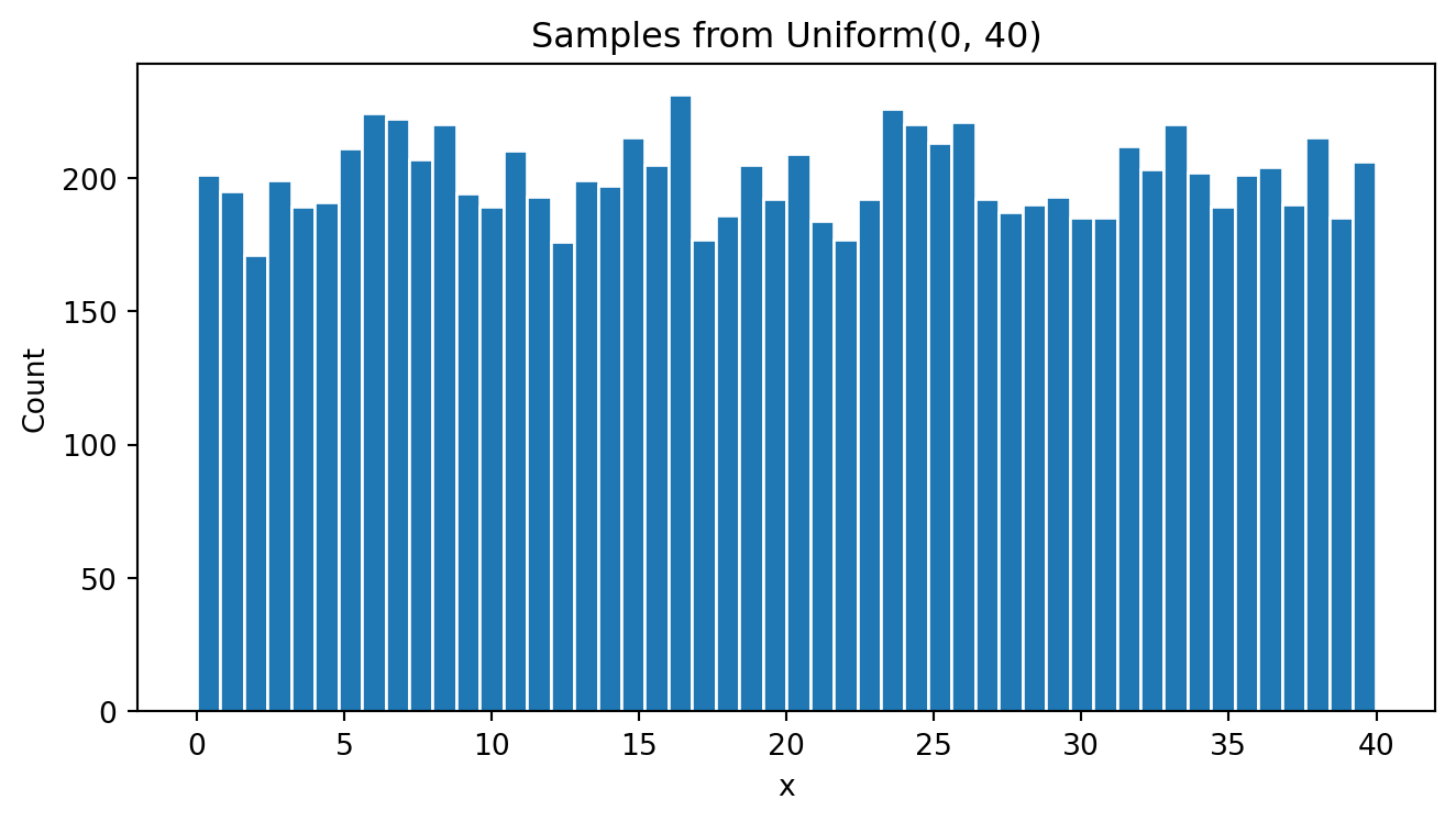
As expected, the histogram looks like a uniform distributed variable where each range of values has similar number of cases.
I can calculate the actual mean and standard deviation:
# Mean of X
print(x.mean())
# SD of X
print(x.std())
20.05886809791931
11.661660471803179Now generate 10,000 groups of 25 uniform random variables to end up in a matrix of 10,000 rows and 25 columns:
# Vector of 25 Uniform(0, 40) RVs; simulate 10,000 vectors
xmatrix = uniform.rvs(size=(10_000, 25))
print("xmatrix shape:", xmatrix.shape)
xmatrix shape: (10000, 25)Now xmatrix will have 10,000 rows and 25 columns of uniform random numbers between 0 and 40:
xmatrix.shape(10000, 25)Now I get the mean of each row, so we end up with 10,000 sample means:
# Means across each 25-draw row
xmean = xmatrix.mean(axis=1)
print(xmean.shape)
xmean(10000,)array([22.15063282, 17.23256749, 23.15589319, ..., 18.45733676,
21.92677681, 19.59711078], shape=(10000,))Now I do a histogram of these sample means that come from a UNIFORM distribution.
# Plot means
plt.figure(figsize=(7,4))
plt.hist(xmean, bins=50, edgecolor="white")
plt.title("Row means of 25 Uniform(0,40) draws (10,000 rows)")
plt.xlabel("mean of 25 uniforms")
plt.ylabel("Count")
plt.tight_layout()
plt.show()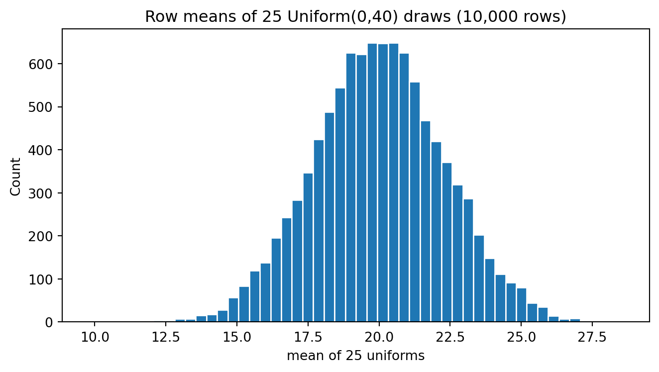
Now I plot both variables in the same plot; the original x uniform variable and the xsample variable (the sample means of x).
# Overlay: means vs single draws
plt.figure(figsize=(7,4))
plt.hist(xmean, bins=50, alpha=0.6, edgecolor="white", label="Means of 25 U(0,40)")
plt.hist(x, bins=50, alpha=0.6, edgecolor="white", label="Single U(0,40) draws")
plt.title("Means vs Single Draws — Uniform(0,40)")
plt.xlabel("Value")
plt.ylabel("Count")
plt.legend()
plt.tight_layout()
plt.show()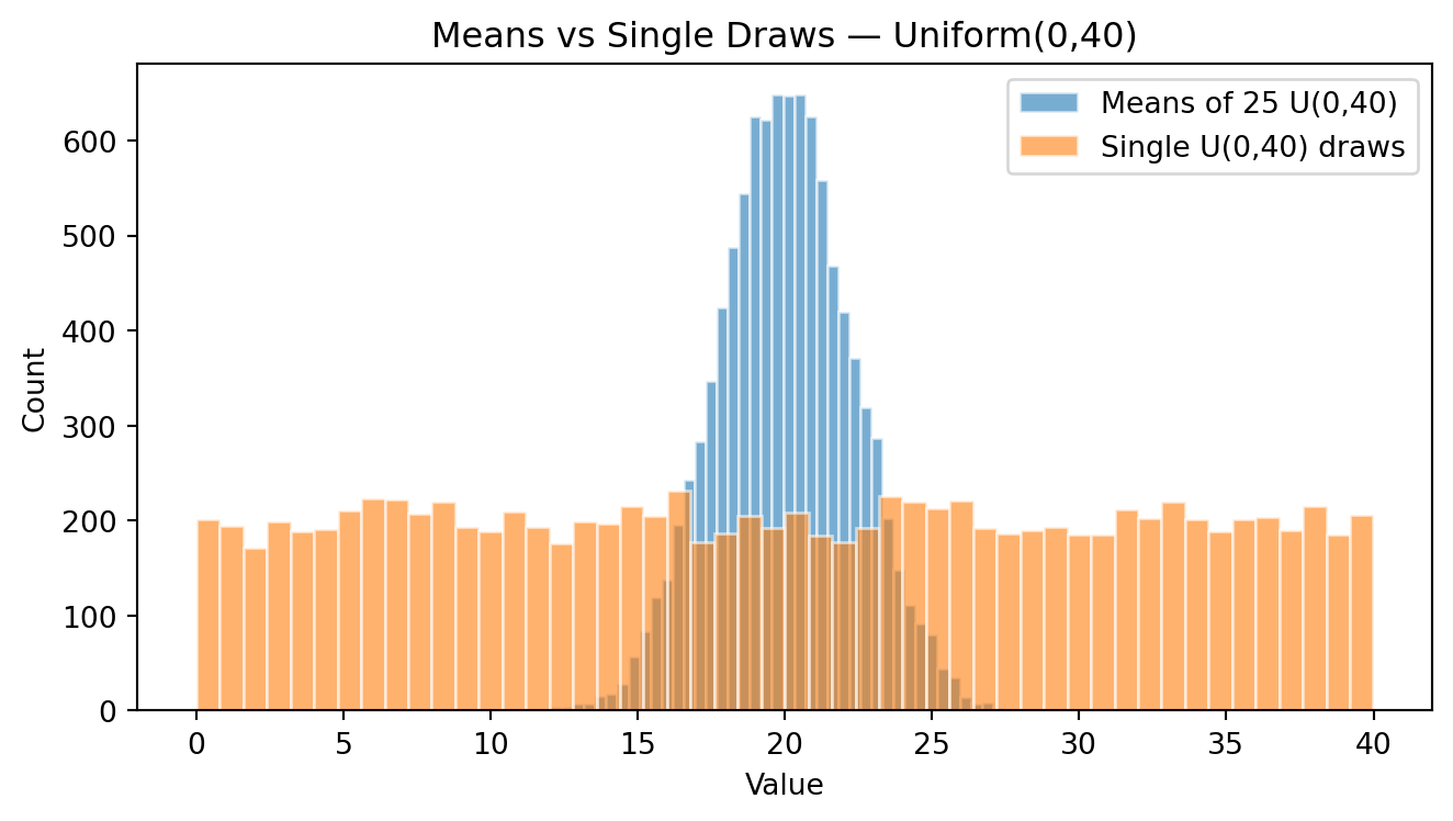
This single plot contains the whole Central Limit Theorem. The two distributions are centred at the same place — around 20 — but they could hardly look more different. The individual draws form a flat rectangle: every value between 0 and 40 is equally likely. The means of 25 draws form a tight bell.
Nothing about the uniform distribution is bell-shaped. The bell emerged purely from the act of averaging.
Let’s confirm with the numbers:
print(f"Individual x     : mean = {x.mean():6.3f}   SD = {x.std():6.3f}")
print(f"Means of 25 draws: mean = {xmean.mean():6.3f}   SD = {xmean.std():6.3f}")
print(f"\nTheoretical SD of the individuals : {(40-0)/np.sqrt(12):.3f}")
print(f"Theoretical SD of the mean of 25  : {(40-0)/np.sqrt(12)/np.sqrt(25):.3f}")
Individual x : mean = 20.059 SD = 11.662
Means of 25 draws: mean = 20.023 SD = 2.294
Theoretical SD of the individuals : 11.547
Theoretical SD of the mean of 25 : 2.309Both means are very close to the theoretical value of 20. But the standard deviation of the means is about one fifth of the standard deviation of the individuals — exactly 1/\sqrt{25} = 1/5, as the algebra predicted. The theory and the simulation agree to three decimal places.
6.3.3 Simulating numbers with the NORMAL probability distribution
Let’s simulate a normal distributed variable Y with mean = 20 and standard deviation = 10.
# -----------------------------
# 2) Normal(mean=20, sd=10)
# -----------------------------
plt.clf()
normal = stats.norm(loc=20, scale=10)
y = normal.rvs(size=10_000)

# Plotting y:
plt.figure(figsize=(7,4))
plt.hist(y, bins=60, edgecolor="white")
plt.title("Samples from Normal(20, 10)")
plt.xlabel("y")
plt.ylabel("Count")
plt.tight_layout()
plt.show()
<Figure size 672x480 with 0 Axes>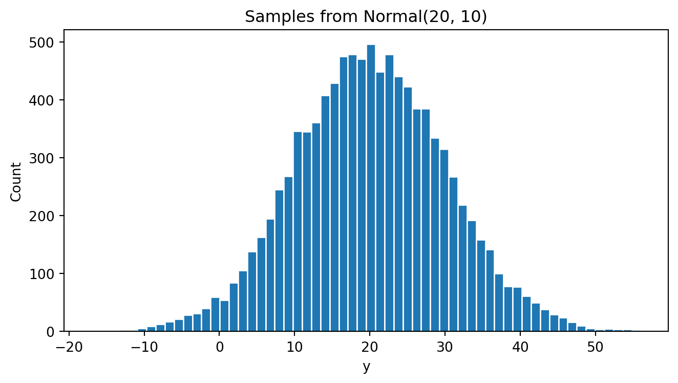
As expected, y behaves like a normally distributed variable. Most values fall between 0 and 40, and the midpoint sits close to 20 — that is, most values lie within 2 standard deviations of the mean, consistent with the empirical rule from Chapter 5.
The mean and standard deviation of the random values (the empirical mean and standard deviation) of y are:
print(y.mean())
print(y.std())
19.79396255438332
10.008563040518597As expected, the empirical mean and standard deviation of y are very similar to the theoretical values (mean of 20 and standard deviation of 10)
Now generate 10,000 groups of 25 NORMAL random variables with mean=20 and SD=10. You will end up with a matrix of 10,000 rows and 25 columns:
# Vector of 25 Normals; simulate 10,000 vectors
ymatrix = normal.rvs(size=(10_000, 25))
print("ymatrix shape:", ymatrix.shape)
ymatrix shape: (10000, 25)Now ymatrix will have 10,000 rows and 25 columns of NORMAL random numbers with mean=20 and SD=10:
print(ymatrix.shape)(10000, 25)Now we get the mean and standard deviation of each vector (row) to get 10,000 sample means:
# Means across rows
ymean = ymatrix.mean(axis=1)
print(ymean)
print(ymatrix.std(axis=1))
[22.395387 22.99862023 16.24483895 ... 17.9686559 19.39617435
18.38864311]
[ 9.70207127 10.22700784 13.11488514 ... 9.07848995 10.02875042
9.57555341]The mean of the y means is very close to 20, the theoretical mean value. However, the standard deviation of the means of y is much smaller than 10, the theoretical standard deviation of the individuals y. The standard deviation of the sample means is close to 2, which is the individual standard deviation divided by the square root of 25 (the size of each group)!
Now do a histogram of these sample means of Y.
# Plot means
plt.figure(figsize=(7,4))
plt.hist(ymean, bins=60, edgecolor="white")
plt.title("Row means of 25 Normal(20,10) draws (10,000 rows)")
plt.xlabel("mean of 25 normals")
plt.ylabel("Count")
plt.tight_layout()
plt.show()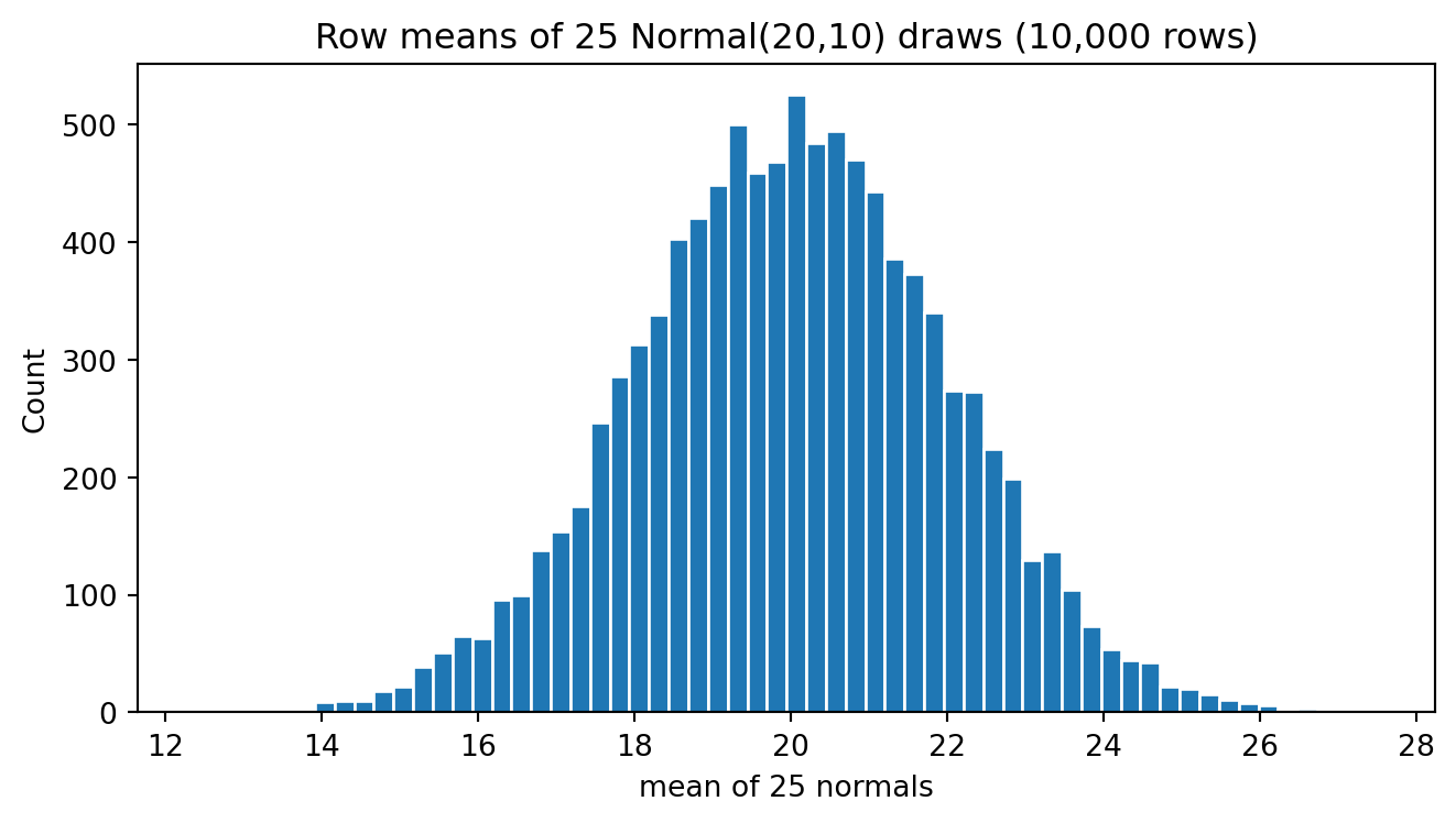
The variability of these means is far smaller than the variability of the individuals. The sample means are centred on 20 with a standard deviation of about 2, so roughly 95% of them fall between 16 and 24 — that is, within 2 standard errors of the mean (20 \pm 2 \times 2). Compare this with the individual y values, 95% of which span the far wider range of 0 to 40.
Now I plot both histograms, the histogram of y and the histogram of ymean:
# Overlay: means vs single draws
plt.figure(figsize=(7,4))
plt.hist(ymean, bins=60, alpha=0.9, edgecolor="white", label="Means of 25 N(20,10)")
plt.hist(y, bins=60, alpha=0.3, edgecolor="white", label="Single N(20,10) draws")
plt.title("Means vs Single Draws — Normal(20,10)")
plt.xlabel("Value")
plt.ylabel("Count")
plt.legend()
plt.tight_layout()
plt.show()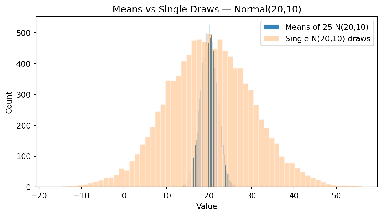
Comparing the two histograms: both are centred on 20 and both are bell-shaped, but the distribution of the means is dramatically narrower — its standard deviation is 2 instead of 10. Here the shape did not change, because the individuals were already normal; a normal variable averaged stays exactly normal. What changed is only the dispersion, and it changed by the predicted factor of 1/\sqrt{25}.
6.3.4 The hardest case: a strongly skewed variable
The uniform distribution is flat but symmetric, and the normal is already bell-shaped. Neither is a real test of the theorem’s most surprising claim. So let’s try the hardest case we can: an exponential distribution, which is severely right-skewed — the shape of waiting times, insurance claims, and many of the business variables we saw in Chapter 3.
expo = stats.expon(scale=20)          # mean = 20, SD = 20, strongly right-skewed
sizes = [1, 2, 10, 50]

fig, axes = plt.subplots(1, 4, figsize=(13, 3.2))

for ax, n in zip(axes, sizes):
    draws = expo.rvs(size=(10_000, n)).mean(axis=1)
    ax.hist(draws, bins=50, edgecolor="white")
    ax.set_title(f"N = {n}\nskewness = {stats.skew(draws):.2f}")
    ax.set_xlabel("sample mean")
    ax.set_yticks([])

plt.tight_layout()
plt.show()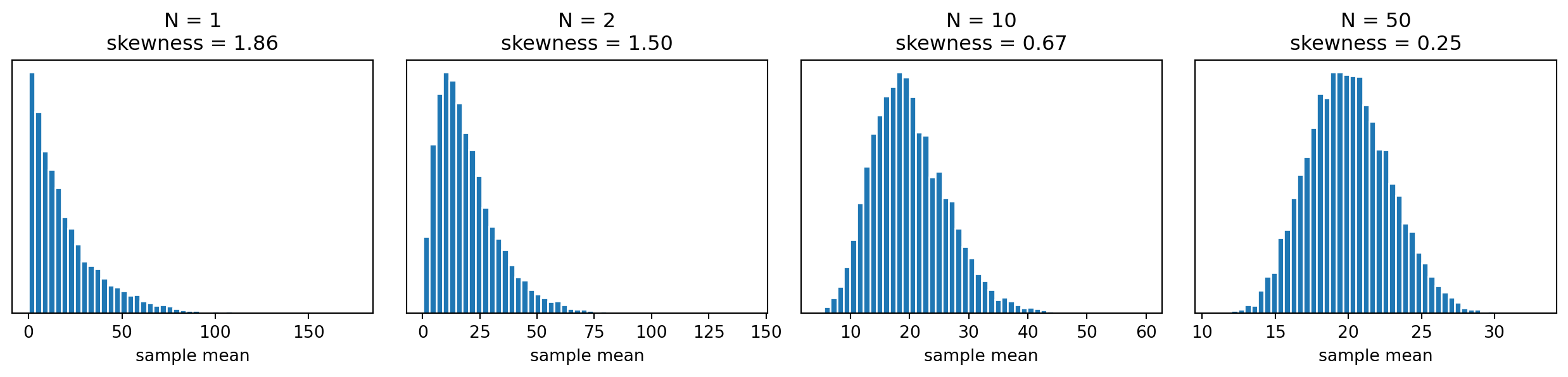
Read the skewness values in the titles from left to right. At N=1 we are simply looking at the exponential variable itself, and it is violently skewed. By N=10 the shape is already recognizably bell-like, and by N=50 the skewness is close to zero and the histogram is nearly symmetric.
This is the theorem’s real content: the normality of the sample mean does not come from the data, it comes from the averaging. And notice the practical qualifier — the more skewed the original variable, the larger the sample you need before the approximation is good. For a symmetric variable N=5 may suffice; for something as skewed as firm assets, you may want several hundred observations before trusting a normal approximation.
6.4 The CLT: formal statement
After these experiments we can state the Central Limit Theorem precisely. For a random variable X with any probability distribution, with mean \mu and finite standard deviation \sigma, if we draw independent random samples of size N, then the sample mean satisfies:
\bar{X} \;\;\sim\;\; N\!\left(\mu,\; \frac{\sigma^{2}}{N}\right) \qquad \text{approximately, for large } N
That is:
The distribution of the sample means is approximately normal, and the approximation improves as N grows. The same holds for other linear combinations such as the sum or a weighted average.
The standard deviation of the sample means — the standard error — shrinks by a factor of 1/\sqrt{N}:
SE(\bar{X}) = \frac{\sigma}{\sqrt{N}}
- The sample mean is centred on the true mean: E[\bar{X}] = \mu. In statistical language, \bar{X} is an unbiased estimator of \mu.
In conclusion: whatever the original probability distribution of a random variable, if we take samples from it, a) the means of those samples are approximately normally distributed, and b) their standard deviation shrinks with the square root of the sample size.
6.4.1 The fine print
Three conditions are worth remembering, because each of them fails somewhere in real business data:
Independence. The observations must be independent, or at least uncorrelated. Correlated observations make the true standard error larger than \sigma/\sqrt{N}.
Finite variance. The variable must have a finite standard deviation. A few genuinely heavy-tailed distributions do not, and for those the CLT simply does not apply.
“Large enough” depends on the skewness. There is no universal threshold. N=30 is a rule of thumb, not a theorem.
6.4.2 What the CLT does not say
Two common misreadings are worth stating explicitly:
The CLT does not say that a large sample of a skewed variable becomes normal. Bitcoin returns do not become normal because you collect more of them — collecting more data gives you a better picture of the same skewed distribution. It is the distribution of the sample mean that becomes normal, not the distribution of the data.
The CLT does not say that everything in nature is normally distributed. Firm assets, city sizes and income are all famously non-normal. What the CLT guarantees is that we can still do valid inference about their averages.
With this result in hand, we can now do something genuinely useful: from a single sample, state how confident we are about a population mean, and test claims about it. That is the subject of Chapter 7.