We might be interested in learning whether there is a pattern of movement of a random variable when another random variable moves up or down. An important pattern we can measure is the linear relationship. The main two measures of linear relationship between 2 random variables are:
Covariance and
Correlation
Let’s start with an example. Imagine we want to see whether there is a relationship between the S&P500 and Microsoft stock.
The S&P500 is an index that represents the 500 biggest US companies, which is a good representation of the US financial market. We will use monthly data for the last 3-4 years.
Let’s download the price data and do the corresponding return calculation. Instead of pandas, we will use yfinance to download online data from Yahoo Finance.
import numpy as npimport pandas as pdimport yfinance as yfimport matplotlibimport matplotlib.pyplot as plt# We download price data for Microsoft and the S&P500 index:prices=yf.download(tickers="MSFT ^GSPC", start="2019-01-01",interval="1mo", auto_adjust=True)# We select Adjusted closing prices and drop any row with NA values:adjprices = prices['Close'].dropna()
[                       0%                       ]
[*********************100%***********************]  2 of 2 completed
^GSPC is the Yahoo Finance ticker symbol for the S&P 500 Composite index.
Now we will do some informative plots to start learning about the possible relationship between GSPC and MSFT.
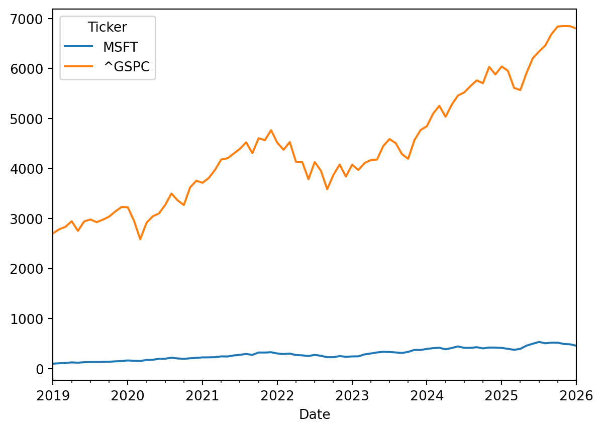
Unfortunately, the range of stock prices and market indexes can vary a lot, so this makes difficult to compare price movements in one plot. For example, if we plot the MSFT prices and the S&P500:
adjprices.plot(y=['MSFT','^GSPC'])plt.show()
It looks like the GSPC has had a better performance, but this is misleading since both investment have different range of prices.
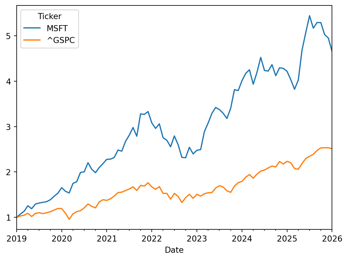
When comparing the performance of 2 or more stock prices and/or indexes, it is a good idea to generate an index for each series, so that we can emulate how much $1.00 invested in each stock/index would have moved over time. We can divide the stock price of any month by the stock price of the first month to get a growth factor:
# I create a dataset to calculate indexes for each variable, where the index value will be a growth factor = its value divided by its first valueindexprices = adjprices / adjprices.iloc[0]
This growth factor is like an index of the original variable. Now we can plot these 2 new indexes over time and see which investment was better:
indexprices.plot(y=['MSFT','^GSPC'])plt.show()
Now we have a much better picture of which instrument has had better performance over time. The line of each instrument represents how much $1.00 invested the instrument would have been changing over time.
Now we calculate continuously compounded monthly returns. In Pandas most of the data management functions works row-wise. In other words, operations are performed to all columns, and row by row:
# I create a new data frame to calculate the log returnsr = np.log(adjprices).diff(1)# The diff function calculates the difference between the log price of t and the log price of t-1# Dropping rows with NA values (the first month has NA's)r = r.dropna()# Renaming the column names to avoid special characters like ^GSPC:r.columns = ['MSFT','GSPC']
Now the r dataframe will have 2 columns for both cc historical returns:
r.head()
MSFT
GSPC
Date
2019-02-01
0.074511
0.029296
2019-03-01
0.051409
0.017766
2019-04-01
0.101963
0.038560
2019-05-01
-0.050747
-0.068041
2019-06-01
0.079843
0.066658
To learn about the possible relationship between the GSPC and MSFT we can look at their prices and also we can look at their returns.
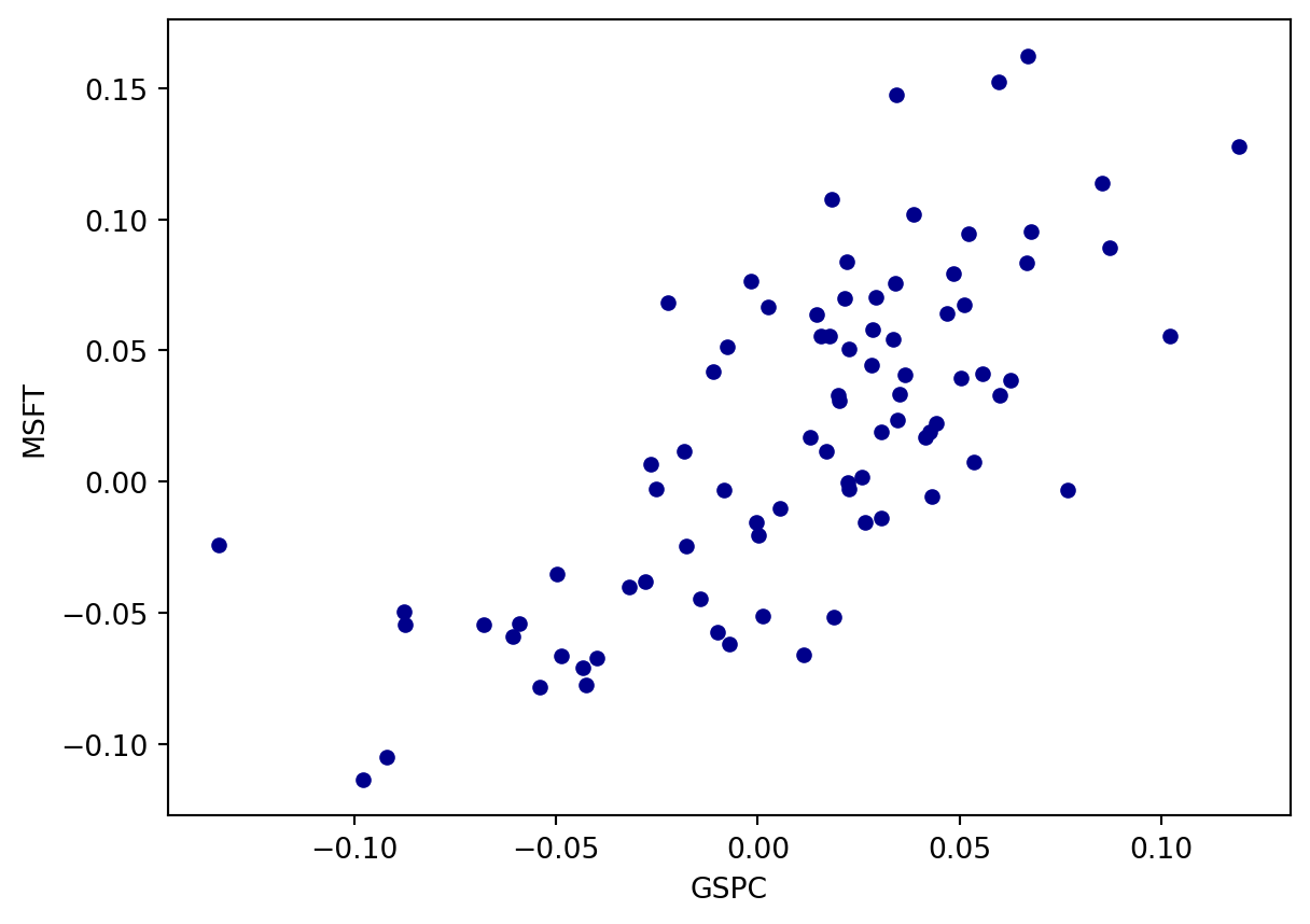
We start with a scatter plot to see whether there is a linear relationship between the MSFT returns and the GSPC returns:
What do you see? The points form a cloud sloping upward from lower-left to upper-right: months in which the market rose tend to be months in which Microsoft rose. The cloud has real scatter around that tendency, which is exactly what a correlation below 1 looks like.
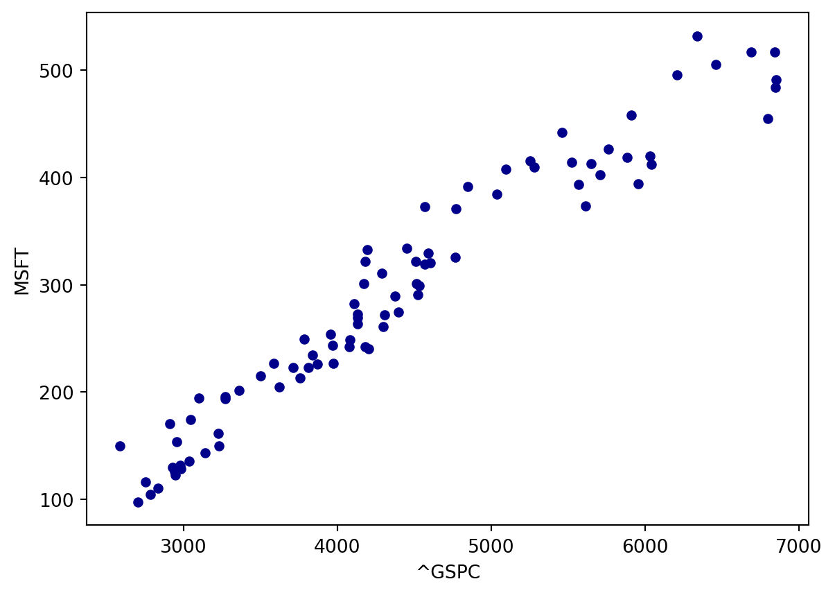
We can also plot the relationship between the MSFT price and the GSPC index level:
Which plot conveys a stronger linear relationship?
The scatter plot using prices appears to show a much tighter linear relationship than the one using returns. This is a trap, and understanding why is one of the most valuable lessons in this chapter.
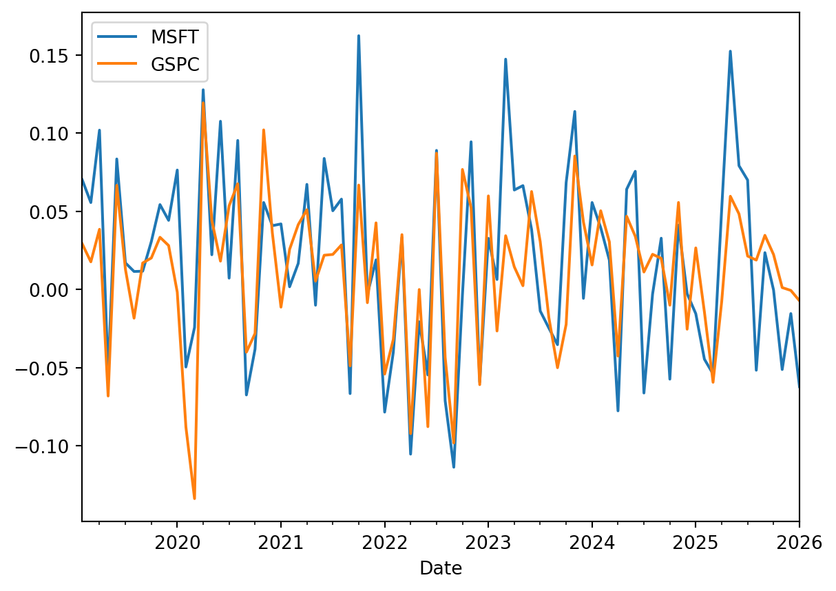
Stock returns do not grow over time; plotted against time they look like a heartbeat monitor:
plt.clf()r.plot(y=['MSFT','GSPC'])plt.show()
<Figure size 672x480 with 0 Axes>
Stock returns behave like a stationary variable: they have no growing or declining trend, and their mean and standard deviation are roughly the same in any time period.
Stock prices and index levels, by contrast, generally grow over time. These are non-stationary variables, whose mean depends on the period you look at.
WarningWhy the price scatter plot is misleading
Two non-stationary series that both trend upward will always appear strongly correlated, even when they have nothing whatsoever to do with each other. The correlation is picking up the shared trend, not any genuine relationship. This is called a spurious relationship.
The classic demonstration: over the twentieth century, the number of stork nests in Europe and the human birth rate were both declining, so they correlate strongly. Storks do not deliver babies — both series were driven by a third factor, urbanization.
The same logic applies to Microsoft’s price and the S&P 500 level. Both rose over the period, so a high correlation is nearly guaranteed and tells us almost nothing. Their returns, by contrast, are stationary, so a correlation between returns reflects genuine co-movement.
Rule: measure linear relationships between stationary variables. Chapter 15 covers this in depth for time-series regression models.
So in this case it is better to look at the relationship between stock returns, not prices.
8.1 Covariance
The Covariance between 2 random variables, X and Y, is a measure of linear relationship.
The covariance is the average of the products of the deviations of X and Y from their respective means.
Before the formula, here is the intuition, which makes everything else obvious. For each observation we compute two deviations: how far X is above or below its mean, and how far Y is above or below its mean. Then we multiply them:
If both are above their means, the product of two positives is positive.
If both are below their means, the product of two negatives is also positive.
If one is above and the other below, the product is negative.
So the product is positive whenever X and Y move together and negative whenever they move in opposite directions. Averaging these products gives a single number whose sign tells us which tendency dominates. If the two variables are unrelated, positive and negative products appear in roughly equal numbers and cancel out, leaving a covariance near zero.
For a sample of size N and two random variables X and Y, the population covariance is:
Why divide by N-1 instead of N? For the same reason as in the variance formula of Chapter 3: we do not know the true population means and must estimate them from the same data using \bar{X} and \bar{Y}. Doing so uses up information, leaving only N-1 independent pieces — the degrees of freedom. Dividing by N-1 makes the sample covariance an unbiased estimator of the true covariance.
The sample covariance is always slightly larger in absolute value than the population formula would give — a bit further from zero in whichever direction it points. When N is large (N > 30) the two are practically identical. The sample formula is the default in all statistical software.
If Cov(X,Y) > 0, then on average there is a positive linear relationship between X and Y. If Cov(X,Y) < 0, the relationship is negative.
A positive linear relationship between X and Y means that if X increases, it is likely that Y will also increase; and if X decreases, it is likely that Y will also decrease.
A negative linear relationship value between X and Y means that if X increases, it is likely that Y will decrease; and if X decreases, it is likely that Y will increase.
To claim that Cov(X,Y) is positive and significant we need a hypothesis test, exactly as in Chapter 7. If the p-value is below 0.05 and the covariance is positive, we can reject the null hypothesis of no linear relationship at the 5% significance level.
The covariance is unbounded:
-\infty<Cov(X,Y)<\infty
This is its fundamental weakness. We can interpret the sign of a covariance, but not its magnitude — because the magnitude depends on the units of both variables. The covariance between two stock returns measured as decimals is 10,000 times smaller than the covariance between the same returns measured in percentage points, even though the relationship is identical. Saying “the covariance is 0.0012” conveys nothing about whether the relationship is strong.
The correlation solves this by standardizing the covariance, producing a unit-free number between −1 and +1 whose magnitude is interpretable.
8.2 Correlation
Correlation is a very practical measure of linear relationship between 2 random variables. It is actually a scaled version of the Covariance:
Corr(X,Y)=\frac{Cov(X,Y)}{SD(X)SD(Y)}
If we divide Cov(X,Y) by the product of the standard deviations of X and Y, we get the correlation, which can have values only between -1 and +1.
-1<=Corr(X,Y)<=1
Dividing by the two standard deviations cancels the units, which is what makes the magnitude interpretable. Correlation is, equivalently, the covariance of the two standardized (z-score) variables from Chapter 4.
If Corr(X,Y) = +1: X and Y lie exactly on an upward-sloping straight line. Every point falls precisely on the line Y = a + bX with b > 0 — a perfect positive linear relationship.
If Corr(X,Y) = -1: the points lie exactly on a downward-sloping straight line, Y = a + bX with b < 0.
If Corr(X,Y) = 0: there is no linear relationship between X and Y. Read that carefully — it does not mean the variables are unrelated or independent. It means no straight-line pattern exists. Two variables can be perfectly, deterministically related and still have a correlation of exactly zero, as we demonstrate below.
If 0 < Corr(X,Y) < 1: there is a positive linear relationship, and the magnitude tells us how tightly the points cluster around the line.
If -1 < Corr(X,Y) < 0: there is a negative linear relationship.
ImportantA correlation is not a probability
A correlation of 0.50 does not mean “there is a 50% probability that Y will increase when X increases”. Correlation and probability are different things measured on different scales, and this is one of the most common misinterpretations.
What a correlation of 0.50 does mean: when X is one standard deviation above its mean, Y is on average 0.50 standard deviations above its own mean. Correlation is the slope of the best-fitting line when both variables are expressed in standard deviations.
There is one interpretation of magnitude that is precise and worth memorizing. The squared correlation, Corr(X,Y)^2, is the proportion of the variance of Y that is explained by its linear relationship with X. A correlation of 0.50 therefore explains 0.50^2 = 25\% of the variance — not half of it. This quantity reappears in Chapter 9 as the R^2 of a regression.
Correlation
Variance explained (r^2)
0.30
9%
0.50
25%
0.70
49%
0.90
81%
The lesson: correlations feel stronger than they are. Squaring them restores perspective.
WarningCorrelation does not imply causation
If X and Y are correlated, there are four possible explanations, and the data alone cannot distinguish between them:
X causes Y.
Y causes X (reverse causality). Advertising spend correlates with sales — but firms also raise advertising budgets because sales are strong.
A third variable Z causes both (a confounder). Ice cream sales correlate with drownings; both are caused by hot weather.
Coincidence, especially with small samples or trending variables — the spurious relationship problem discussed above.
Establishing causation requires either a controlled experiment (an A/B test) or careful research design. Every regression model in the rest of this book measures association; whether that association is causal is a question about how the data was generated, not about the statistics.
If we want to test that Corr(X,Y) is positive and significant, we need to do a hypothesis test. The formula for the standard error (standard deviation of the correlation) is:
SD(corr)=\sqrt{\frac{(1-corr^{2})}{(N-2)}}
Then, the t-Statistic for this hypothesis test will be:
t=\frac{corr}{\sqrt{\frac{(1-corr^{2})}{(N-2)}}}
If Corr(X,Y)>0 and t>2 (its pvalue will be <0.05), then we can say that we have about 95% confidence that there is a positive linear relationship; in other words, that the correlation is positive and statistically significant (significantly greater than zero).
8.3 Calculating covariance and correlation
We can program the covariance of 2 variables according to the formula:
The cov function calculates the variance-covariance matrix using both returns. We can find the covariance in the non-diagonal elements, which will be the same values since the covariance matrix is symmetric.
The diagonal values have the variances of each return since the covariance of one variable with itself is actually its variance (Cov(X,X) = Var(X) ) .
Then, to extract the covariance between MSFT and GSPC returns we can extract the element in the row 1 and column 2 of the matrix:
cov = covm[0,1]print(f"Covariance of MSFT with GSPC returns = {cov}")# In Python the first row of an array or a data frame has the position number zero.
Covariance of MSFT with GSPC returns = 0.00214884247566059
This value is exactly the same we calculated manually.
We can use the corrcoef function of numpy to calculate the correlation matrix:
The correlation matrix will have +1 in its diagonal since the correlation of one variable with itself is +1. The non-diagonal value will be the actual correlation between the corresponding 2 variables (the one in the row, and the one in the column).
We could also manually calculate correlation using the previous covariance:
corr2 = cov / (r['MSFT'].std() * r['GSPC'].std())corr2print(f"The correlation between MSFT and GSPC returns is = {corr2}")
The correlation between MSFT and GSPC returns is = 0.6499719714627272
We can use the scipy pearsonr function to calculate correlation and also the 2-tailed pvalue to see whether the correlation is statistically different than zero:
from scipy.stats import pearsonrres = pearsonr(r['MSFT'], r['GSPC'])print(f"Correlation = {res.statistic:.4f}")print(f"Two-tailed p-value = {res.pvalue:.3e}")print(f"Variance of MSFT returns explained by GSPC returns = "f"{100*res.statistic**2:.1f}%")
Correlation      = 0.6500
Two-tailed p-value = 3.141e-12
Variance of MSFT returns explained by GSPC returns = 42.2%
The p-value is essentially zero, so MSFT and GSPC returns have a positive and highly significant correlation. Note the third line, though: even with a strong correlation, market movements explain only part of Microsoft’s return variance. The remainder is firm-specific — driven by Microsoft’s own earnings, products and news. Decomposing return variance into a market component and a firm-specific component is exactly what the market model of Chapter 11 does.
8.4 Correlation only sees straight lines
The correlation coefficient measures linear association and nothing else. This limitation is easy to state and easy to forget, so let’s make it vivid with two demonstrations.
First, a variable that is perfectly determined by another, yet has essentially zero correlation with it:
x_sym = np.linspace(-3, 3, 200)y_sym = x_sym**2# Y is perfectly determined by Xplt.figure(figsize=(5, 3.5))plt.scatter(x_sym, y_sym, s=10)plt.title(f"Y = X² | correlation = {np.corrcoef(x_sym, y_sym)[0,1]:.4f}")plt.xlabel("X"); plt.ylabel("Y")plt.tight_layout()plt.show()
Figure 8.1: A perfect deterministic relationship (Y = X squared) with a correlation of approximately zero.
Knowing X tells you Y exactly, yet the correlation is zero. The relationship is perfectly strong and perfectly non-linear, and correlation is blind to it. This is why “zero correlation” must never be reported as “no relationship”.
Second, Anscombe’s quartet — four datasets constructed by the statistician Francis Anscombe in 1973, all with virtually identical means, variances and correlations:
Figure 8.2: Anscombe’s quartet: four datasets with nearly identical summary statistics but completely different structure.
All four have a correlation of about 0.816 and the same fitted line, yet:
I is a genuine noisy linear relationship — the only one where the summary statistics are honest.
II is a perfect curve. A linear measure is simply the wrong tool.
III is perfectly linear except for one outlier, which drags the fitted line away from the true pattern.
IV has no relationship at all between X and Y; a single influential point at X = 19 manufactures the entire correlation.
The moral, and the reason this chapter has so many scatter plots: always plot your data before trusting a correlation. A summary statistic compresses a dataset into one number, and Chapter 3 already warned us that compression can hide exactly the features that matter most.
With this measure of linear relationship in hand, we are ready to move from describing a relationship to modeling it — which is the subject of Chapter 9.