5Chapter 5 - The Histogram and the Normal Distribution
5.1 The Histogram
The histogram shows how the values of a random variable are distributed across its whole range. It is a frequency plot: the range of values is divided into intervals called bins, and the height of each bar is the number of observations falling into that bin. More frequent ranges get taller bars.
From a histogram we can read off the most common values, the least common values, and a rough sense of the mean and standard deviation — as well as the shape of the distribution, which Chapter 3 showed us is what determines which summary measures we should trust in the first place.
TipHow many bins?
The number of bins is a genuine choice, and it changes what you see. Too few bins and the histogram hides real structure — a bimodal variable can look unimodal. Too many bins and every random fluctuation becomes a visible spike. Common rules of thumb are k = \sqrt{n} bins, or Sturges’ rule k = 1 + \log_2(n), but the honest practice is to try two or three values and check that your conclusion does not depend on the choice. If it does, that itself is worth reporting.
In my opinion, the most important foundations/pillars of both, Statistics and the theory of Probability are:
The invention of the Histogram
The discovery of the Central Limit Theorem
Although the idea of a histogram sounds a very simple idea, it took many centuries to be developed, but it has profound impact in the development of Probability theory and Statistics, which both are the pillars of all sciences.
I enjoy learning about the origins of the great ideas of humanity. The idea of the histogram was invented to decipher encrypted messages.
5.1.1 Interesting facts about the History of the Histogram
It is documented that the encryption of messages -cryptography- was commonly used since the beginning of civilizations. Unfortunately, it seems cryptography was invented by ancient Kingdoms mainly for war strategies. According to Herodotus, in the 500s BC, the Greeks used cryptography to win a war against the powerful Persian troops (Singh 2000).
Cryptography refers to the methods of ciphering messages, while cryptanalysis refers to the methods to decipher encrypted messages.
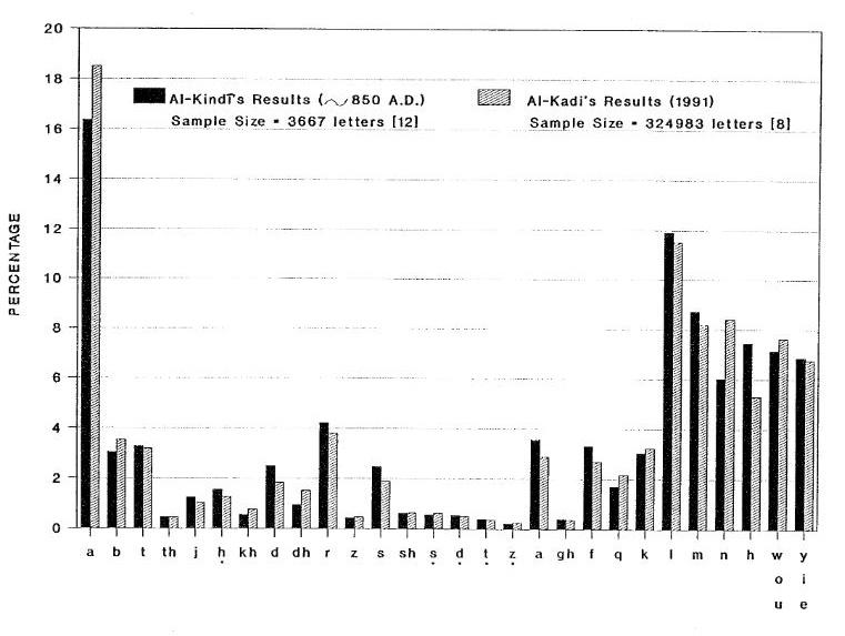
The Arabs in the years 800-900 AD were among the first to decipher encrypted messages thanks to their invention about the idea of the histogram. According to Singh (2000) and Al-Kadit (1992), in 1987 several ancient Arabic manuscripts related to cryptography and cryptanalysis (written between the year 800 AD and 1,500 AD) were discovered in Istanbul, Turkey (they were translated into English until 2002). This is a very fascinating story!
Below is an example of a frequency plot by Arabic philosopher Al-Kindi in the 850 AD compared with a recent frequency plot by Al-Kadi:
The encrypted messages of that period were written with the Caesar shift method, which replaces each letter of the alphabet by another letter a fixed number of positions away. To break such a message, the Arab cryptanalysts counted how often each character appeared, built a frequency plot, and matched the most frequent encrypted characters against the most frequent characters of ordinary Arabic. They then substituted the matched characters back into the message to decipher it.
This is worth pausing on, because it is the first recorded use of a statistical idea that still underlies modern analytics: the shape of a frequency distribution is a fingerprint. The cipher hides which letter is which, but it cannot hide how often each one occurs. Al-Kindi realized that the distribution itself carries information that survives the encryption — the same logic by which we today infer properties of a population from the shape of a sample.
Remarkably, the idea then waited about 1,000 years to be picked up by French mathematicians building the foundations of statistics. In the 1700s and early 1800s, Abraham de Moivre and Pierre-Simon Laplace used it to develop the Central Limit Theorem (CLT).
I believe the CLT is one of the most important and fascinating mathematical discoveries of all time.
The English scientist Karl Pearson coined the term histogram in 1891 when he was developing statistical methods applied to Biology.
Why the histogram is so important in Statistics? I hope we will find this out during this course!
5.2 Illustrating the Histogram
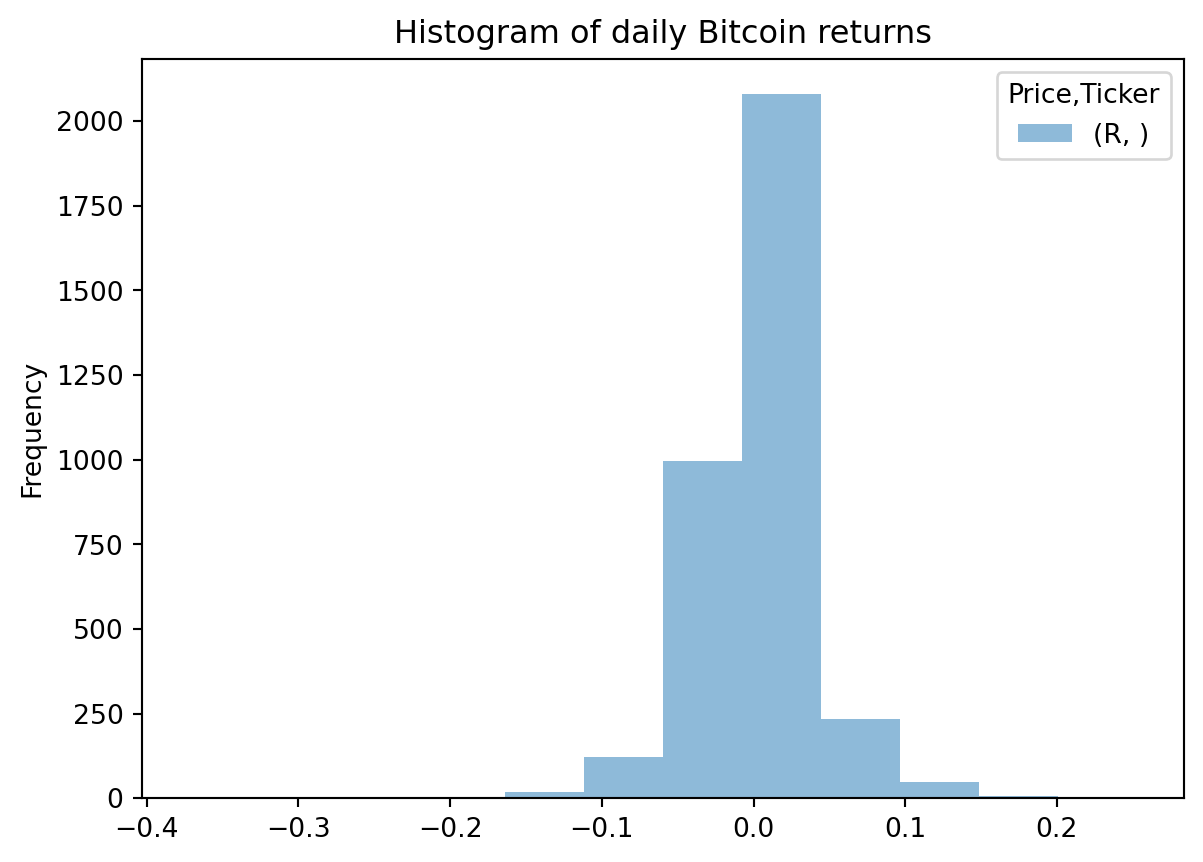
Let’s build a histogram of a real financial variable. We download the daily price of Bitcoin since 2017 and compute both types of return introduced in Chapter 4 — simple returns R and continuously compounded returns r. We use interval="1d" to obtain daily rather than monthly data.
# !pip install yfinanceimport yfinance as yfimport numpy as npimport pandas as pdBTC = yf.download(tickers="BTC-USD", start="2017-01-01", interval="1d")# Simple return and continuously compounded (log) return:BTC["R"] = (BTC["Close"] / BTC["Close"].shift(1)) -1BTC["r"] = np.log(BTC["Close"]).diff(1)# Keep an object with only the returns:BTCR = BTC[["R", "r"]].copy()BTCR.describe().round(4)
[*********************100%***********************] 1 of 1 completed
Figure 5.1: Histogram of daily Bitcoin simple returns since 2017.
The histogram is roughly symmetric and centred close to zero — daily returns are about as likely to be positive as negative, and typically small. But notice how much of the horizontal axis is occupied by bars that are essentially invisible. Those are the days when Bitcoin moved 20% or 30%. They are rare, but they are not absent, and we will see shortly that a normal distribution would say they should never happen at all.
The histogram describes what a random variable did. To describe what a random variable is expected to do, we need the concept of a probability density function — the theoretical counterpart of the histogram.
5.3 Probability Density Functions (PDF)
5.3.1 Probability Density Function of a Discrete random variable
The Probability Density Function (PDF) of a discrete random variable X is the probability of X to be equal to a specific value x_{i}:
f(x)=P(X=x_{i})
For example, when throwing a dice there are six possible outcomes: 1,2,3,4,5 and 6. All of them with the same probability since these outcomes are independent events. Every outcome has a 1/6 chance of happening. The PDF for a fair six-sided dice can be defined as:
f(x)=P(X=x_{i})=\frac{1}{6}
Where x_i=1,2,3,4,5,6
Now, instead of considering the probability of every independent outcome to take place, you might wonder about the probability of getting any number equal or less than x_{i} when throwing a dice. It seems pretty obvious that the probability would be 50% for x_{i}=3 and 100% for x_{i}=6. In plain words, we can say that getting 1,2 or 3 are 50% of the cases when throwing a dice, and a range from 1 to 6 will cover all the possibilities.
Mathematically we can express the Cumulative Density Function (CDF) as:
f(x)={\sum_{i=1}^{n}}P(X=x_{i})
Following the example of the dice, we can compute the CDF for every possible outcome as follows:
P(X\leq1)=\frac{1}{6}=0.17
P(X\leq2)=\frac{2}{6}=0.33
P(X\leq3)=\frac{3}{6}=0.50
P(X\leq4)=\frac{4}{6}=0.67
P(X\leq5)=\frac{5}{6}=0.83
P(X\leq6)=\frac{6}{6}=1
We have now covered the PDF and the CDF for a six-sided die, and the results are intuitive to anyone who has played with dice. But what happens if we combine the results of two dice? This is more useful than a single die, since most games and casinos use a pair.
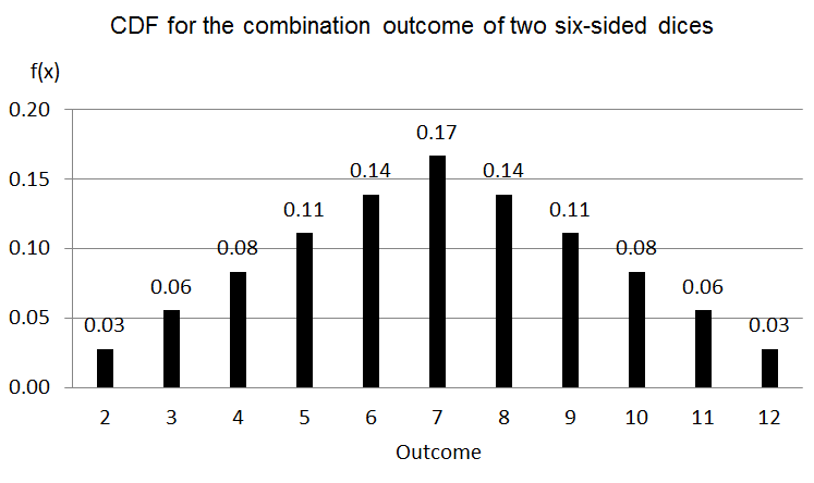
When we consider the sum of two dice, S, the range of possible outcomes runs from 2 to 12, and the PDF is f(S)=P(S=x_{i}) for i = 2, 3, \ldots, 12. There are 36 equally likely combinations in total. Only one combination produces a 2 (1+1) and only one produces a 12 (6+6); two combinations produce a 3 (1+2 and 2+1), and so on. The most likely outcome is 7, which arises from six different combinations:
S
2
3
4
5
6
7
8
9
10
11
12
f(S)
1/36
2/36
3/36
4/36
5/36
6/36
5/36
4/36
3/36
2/36
1/36
We can see this PDF as follows:
The shape of this PDF for the sum of two dice already resembles the famous bell curve of the normal distribution. There is one essential difference: the normal distribution describes a continuous random variable, whereas the sum of two dice is discrete.
But the resemblance is not a coincidence, and it is worth naming now. A single die is uniform — every face is equally likely, and its PDF is flat. Add two of them and a peak appears in the middle. Add three, and the shape becomes noticeably bell-like. The bell shape is not a property of dice; it is a property of summing independent random variables, whatever their individual distribution. That is the Central Limit Theorem, and Chapter 6 is devoted to it.
5.3.2 Probability density function (PDF) of a Continuous Random Variable
As seen in previous section, the CDF of a discrete random variable is defined as the sum of the probabilities of the independent outcomes. However, when using a continuous random variable the CDF will be defined as the integration of the function f(x) (f(x) is the PDF).
For a continuous variable we do not compute the probability that X takes a particular value, as we did in the discrete case. In fact, the probability that a continuous random variable equals any specific value is exactly zero — there are infinitely many possible values, so no single one can carry positive probability. (Think of asking for the probability that a person is exactly 1.750000… metres tall.)
Instead we compute the probability that X falls within a range between a and b. Since the variable must take some value, the total area under the PDF is 1:
\int_{-\infty}^{\infty} f(x)\,dx = 1
\int_{a}^{b} f(x)\,dx = P(a\leq x\leq b)
So the probability that a continuous random variable X lies between a and b is the area under the PDF over the interval [a,b]. This is the continuous analogue of adding up bar heights in a histogram.
For example, take the PDF f(x)=3x^{2} defined on 0 \leq x \leq 1. The probability that X lies between 0.5 and 1 is:
This makes sense: 12.5% is the complement of 87.5%, and together they account for the full range 0 \leq x \leq 1, so the two probabilities must sum to 1.
Notice how much probability mass sits in the upper half of the range. Because f(x)=3x^2 increases with x, values near 1 are far more likely than values near 0 — this PDF describes a strongly left-skewed variable, and the integral confirms it: 87.5% of the probability lies in the top half of the range.
Warning
Not every function is a valid PDF. Two conditions must hold: f(x) \geq 0 everywhere, and the integral over the whole range must equal exactly 1. Also note that f(x) itself is a density, not a probability — it can exceed 1. Only areas are probabilities.
Now we move to the most famous PDF, the Normal Distribution Function.
5.4 The Normal Distribution Function
In statistics, the most popular continuous PDF is the well-known “bell-shaped” normal distribution, which PDF is defined as:
where \mu is the mean of the distribution and \sigma^{2} is the variance of the distribution. For simplification purposes, the normal distribution can also be denoted as X\sim N(\mu,\sigma^{2}) where X is the continuous random variable, "\sim" means distributed as and N means normal distribution.
So only two parameters are needed to fully determine the behavior of the continuous random variable X:
the mean of X, \mu, which locates the center, and
the variance of X, \sigma^2, which controls the width.
This is a remarkably strong claim. It says that if a variable is normal, then knowing its mean and variance tells you everything — every probability of every range is determined. No other information is needed, and none is available. It also implies that the normal distribution is symmetric around \mu, so its mean, median and mode coincide. In the language of Chapter 3: for a normal variable, the mean/SD pair and the median/IQR pair carry the same information, which is exactly why the choice between them only matters for non-normal data.
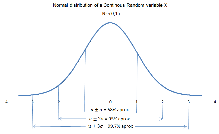
Another important property is the probability contained within ranges defined by \sigma — the empirical rule:
For (\mu-\sigma) \leq x \leq (\mu+\sigma), the area under the curve is approximately 68%
For (\mu-2\sigma) \leq x \leq (\mu+2\sigma), the area is approximately 95%
For (\mu-3\sigma) \leq x \leq (\mu+3\sigma), the area is approximately 99.7%
The empirical rule: areas under the normal curve
These three numbers are worth memorizing, because they turn a standard deviation into an intuition. They also connect directly to the boxplot fences of Chapter 3: the 1.5 × IQR rule leaves about 0.7% of a normal distribution outside the whiskers, which is roughly the same tail probability as the 3σ rule.
If our variable of interest is the continuously compounded return r, and these returns follow a normal distribution r \sim N(\mu, \sigma^{2}), then the expected future return is the mean of the distribution while the standard deviation serves as a measure of risk. This identification of risk with \sigma is the foundation of modern portfolio theory — and, as we are about to see, one of its most criticized assumptions.
5.5 Interesting facts about the History of the Normal Distribution
The normal distribution is one of the most consequential discoveries in statistics. It describes an extraordinary range of phenomena — measurement errors, human height, examination scores, and, at least approximately, financial returns.
Many people believe Carl Friedrich Gauss discovered it, which is why it is often called the Gaussian distribution. That is not quite right. The French-born mathematician Abraham de Moivre (1667–1754) found it first, around 1733, while studying the distribution of the sum of independent binomial random variables — essentially, the outcome of many coin flips. A Huguenot who fled religious persecution in France and spent his life in London, de Moivre never obtained a university position and reportedly earned a living advising gamblers in coffee houses on problems of chance. He published the result in an appendix to The Doctrine of Chances, and it attracted little attention at the time.
Pierre-Simon Laplace (1749–1827) generalized the result substantially in the early 1800s, extending it beyond the binomial case toward what we now recognize as the Central Limit Theorem.
Gauss entered the story from a completely different direction. In 1809, working on the problem of estimating the orbits of celestial bodies from imprecise telescope observations, he asked which distribution of measurement errors would make the arithmetic mean the most probable estimate of the true value. The answer was the normal distribution. This is why it became associated with his name, and why the method he developed alongside it — least squares — is the foundation of Chapter 9 of this book.
There is a pleasing symmetry here: the same distribution was discovered independently by a mathematician studying games of chance and by an astronomer studying measurement error. That is a hint about why it appears so widely, and the explanation is the Central Limit Theorem, to which we turn in the next chapter.
WarningA caution about financial returns
The claim that financial returns are normally distributed is a useful approximation, not a fact. Real return distributions have fat tails: extreme moves occur far more often than a normal distribution predicts. Benoit Mandelbrot pointed this out as early as the 1960s. Under a normal distribution, a 5-sigma daily move should occur roughly once every 14,000 years; in real markets, moves of that size happen every few years. This is not a small technical caveat — risk models that assume normality systematically understate the probability of exactly the events that matter most. Keep this in mind as you look at the simulation in the next section.
5.6 Simulating the normal distribution
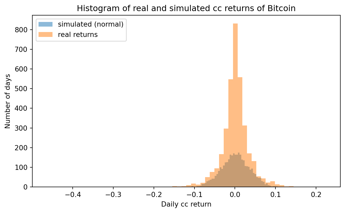
Here is a simple but revealing experiment. We take the mean and standard deviation of the historical cc returns of Bitcoin, generate the same number of artificial returns from a normal distribution with exactly those two parameters, and plot both histograms together.
If Bitcoin returns really were normal, the two histograms would be indistinguishable — remember, a normal distribution is completely determined by its mean and variance, so matching those two numbers would match everything.
Code
from matplotlib import pyplotpyplot.clf()rmean = BTCR["r"].mean()rsd = BTCR["r"].std()N = BTCR["r"].count()simr = np.random.normal(loc=rmean, scale=rsd, size=N)realr = BTCR["r"].dropna().to_numpy()bins =60pyplot.figure(figsize=(8, 4.5))pyplot.hist(simr, bins, alpha=0.5, label="simulated (normal)")pyplot.hist(realr, bins, alpha=0.5, label="real returns")pyplot.legend(loc="upper left")pyplot.title("Histogram of real and simulated cc returns of Bitcoin")pyplot.xlabel("Daily cc return")pyplot.ylabel("Number of days")pyplot.show()
<Figure size 672x480 with 0 Axes>
(a) Real Bitcoin cc returns versus simulated normal returns with the same mean and standard deviation.
(b)
Figure 5.2
Do you see the difference? Two features stand out, and both are typical of financial returns:
The real distribution is more peaked. There are more days than the normal predicts on which almost nothing happens.
The real distribution has fatter tails. The extreme returns at the far left and far right of the plot simply do not appear in the simulated series.
These two features go together and have a name: excess kurtosis, or leptokurtosis. Let’s quantify it and check the tails directly:
from scipy import statsprint(f"Mean : {realr.mean():.5f}")print(f"Standard deviation : {realr.std(ddof=1):.5f}")print(f"Skewness : {stats.skew(realr):.3f} (0 for a normal distribution)")print(f"Excess kurtosis : {stats.kurtosis(realr):.3f} (0 for a normal distribution)")# How many days moved more than 4 standard deviations from the mean?z = (realr - realr.mean()) / realr.std(ddof=1)observed =int((np.abs(z) >4).sum())expected =len(z) *2* stats.norm.sf(4)print(f"\nDays with |z| > 4 — observed : {observed}")print(f"Days with |z| > 4 — expected under normality : {expected:.2f}")
Mean               : 0.00118
Standard deviation : 0.03564
Skewness           : -0.650   (0 for a normal distribution)
Excess kurtosis    : 12.133   (0 for a normal distribution)

Days with |z| > 4 — observed : 21
Days with |z| > 4 — expected under normality : 0.22
The last two lines are the important ones. Under a normal distribution we would expect a fraction of a single day beyond four standard deviations in this sample; the real data contains many. The excess kurtosis is far above zero, confirming numerically what the histogram shows.
Why this matters practically. If you managed risk for a portfolio using the normal assumption, you would compute your worst-case scenarios from a distribution that assigns essentially zero probability to the events that have actually bankrupted institutions. The normal distribution remains an indispensable approximation — the Central Limit Theorem in Chapter 6 explains why it works so well for averages, which is what most of our statistical inference concerns — but for the raw returns themselves it understates tail risk.
TipAn exercise
Re-run the simulation using monthly instead of daily returns (interval="1mo"). You should find that the excess kurtosis shrinks noticeably. A monthly return is the sum of about 30 daily returns, and summing independent random variables pushes their distribution toward normality — the Central Limit Theorem at work on real data. This is one of the most useful facts in empirical finance.
Al-Kadit, Ibrahim A. 1992. “Origins of Cryptology: The Arab Contributions.”Cryptologia 16 (2): 97–126.
Singh, Simon. 2000. The Code Book: The Science of Secrecy from Ancient Egypt to Quantum Cryptography. Anchor Books.